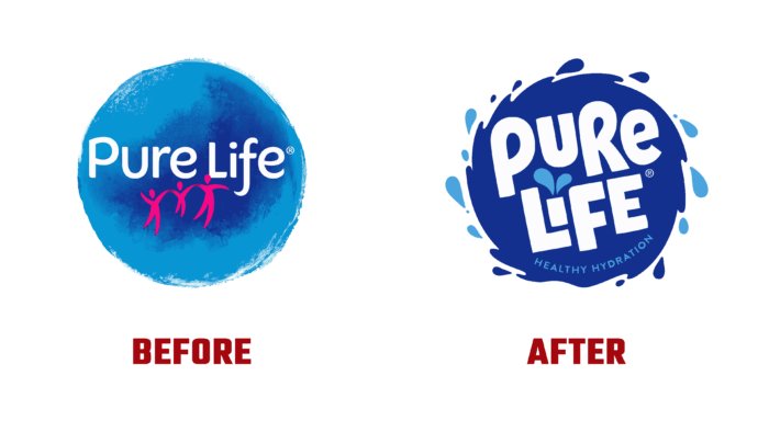
Drinking water from NESTLE® has never changed the established standards over the years of its production. Its amazing taste high quality that meets all existing requirements are distinctive characteristics recognized worldwide. Today, the brand has decided to make adjustments to the visual identity of its product to draw more attention to it from the consumer side, to remind him to take his health seriously, using only quality products, especially water. Understanding that water is the basis of all life on Earth, the brand pays the most serious attention to quality control and the design of packaging and containers. Today, NESTLE® has revised the visual design of containers and packaging, enhancing the effect of visual impact on the consumer, removing the image that has bothered everyone.
The new packaging design is as refreshing as the invigorating liquid that fills traditional containers. The breathtaking look created by designers has become more modern, attractive, and informative. At the same time, it was given some fun to make the brand more fun and friendly. The emphasis on color tint has been changed. Now the brand’s main color has become a bright and cheerful bright yellow. The traditional color of water – blue – remained only on the element with the logo. Now a package with your favorite water can be seen from afar, even among the huge mass of offers from alternative manufacturers.
The brand’s little people have become more joyful, retaining their bright red color but in a more saturated shade. They are created with just one line, without separation, indicating the unity and commonality of striving for one goal. The font of the brand name is bold sans-serif. It is cheerful and simple, made in white on a dark blue circle, symbolizing a huge drop of the purest water that is in motion. The emblem is simple and easy to remember. Its graphics ensure that the brand name is read from a distance, making it convenient to use even in the smallest formats where space is limited. The typography of the sign is as readable as possible, and its digital design provides a clear perception of each element of the composition.
The new design is a solution that will increase sales by making the product more visible and demonstrate the brand’s desire to keep up with the times, both in its development and in creating image elements.


