The WÖW effect of the Colombian healthy snack brand Ö-lab is now becoming available to many consumers. Designed as an attractive offering of delicious and exotic snacks on the go, the brand has set itself the important task of constantly surprising its customers. Together with the unique offerings from Ö-lab, it becomes easy and simple to go beyond their preferences, becoming an admirer of Colombian, Andean, and tropical exotics, where the WÖW factor allows to enjoy great ingredients and original national superfoods, giving joy, happiness, passion from realizing the unsurpassed sensations.
The brand strives to acquaint the whole world with the magic of its exotic cuisine, with the incredible stories accompanying each of its products, making them even more attractive and desirable. The best raw materials, appreciation, and love from each of the farmers who put their hand in the production give a unique touch to each dish, giving each customer the belief that dreams are sure to come true. This is reflected in the brand identity, which has recently been somewhat rethought and redesigned.
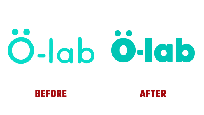
The identity of Ö-lab was not subjected to radical changes. The main reason for the rebranding was the search for a new corporate identity and a change in the appearance of the packaging, which could provide the most attractive and surprising in its execution on the shelves of the supermarkets. The visualization was based on the idea that healthy food is not necessarily clean and delicate. But its display should always be bold, fun, and colorful. This approach was reflected in the new visuals and packaging, which included a lot of bright colors and shades, bold typography, and a lot of effective and attractive graphic elements aimed at accentuating their healthy focus. Together, the entire composition ensured the formation of a uniquely WÖW effect.
The effectiveness of the previously created identity was the reason for not making drastic changes to the company’s logo. Keeping it practically in its original version – the textual name of the brand, the designers made the letters thicker, catchy. The redesign of the logo was built on the visual effect of changing the graphic design of a familiar element.


