Formula 1 will meet the 2025 championship with new equipment – with a 100% environmentally friendly hybrid engine, for which it has prepared by changing its visual identity. The second-generation engine will run on an improved environmentally friendly fuel with a carbon-neutral balance. Negotiations are now being completed with fuel companies on setting up fuel production of the new formula in volumes sufficient for refueling sports cars during training and championships. Solving this challenge and the emergence of hybrid engines in real-time is a significant step towards the transition to electrified vehicles, which will be the most effective path to the beneficial effect of technology on the environment. The powerplant developed for F1 is currently the most efficient in the world. At the same time, it provides a high power indicator with significantly lower fuel consumption than those currently used. This also affects the amount of CO2 released. This technology, coupled with a sustainable new fuel formula, could be a game-changer, not just in sports itself.
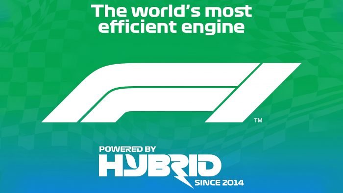
The creation of such an engine responds to the constant criticism that F1 is one of the main polluting sports that do not seek to renew. To attract as many people as possible to this situation, to demonstrate the sustainability of the nature of the new fuel and the properties of the hybrid engine, the brand decided to carry out a complete rebranding, adding important information about the new changes to its visualization. The new logo has been redesigned to meet the requirements of modern digital demonstration technologies. The designers have provided quality support for television graphics in the paddock, pit lane, which are the main way to showcase the championships and related events. The new branding has acquired an original color palette in line with the changed strategy and updated content of the company. Green gradient background smoothly turning into a blue – effective symbolization of care for the purity of the surrounding nature and air. The effect is enhanced by a new slogan placed at the bottom of the emblem under the sign – powered by hybrid since 2014.
The logo font is made in white, which looks very impressive against the chosen corporate shade of the background. Slogan letters are a variant of the modern digital font type, characterized by the roundness of shapes and attractive graphics. The letter R is made without its leg, as a symbol of the zigzag of the race track, and has a lightning bolt at the end, which indicates the speed and power of the new engine. The main symbol – F1, is depicted with a right tilt, symbolizing speed, movement. The letter F is made of two parallel parts – stylized depicting the championship track.


