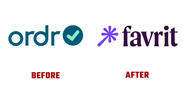
A magical and amazing brand – Favrit is now always there. His “magical” abilities, activated with a special magic wand Favrit, form the basis of such a magical and amazing journey. Being the latest solution that simplifies ordering and settlements in its area from Norwegian manufacturers, the application solves an important strategic task – it simplifies the process of formation and registration throughout the chain as much as possible. When designing the new app, the Scandinavian Design Group from Oslo, Norway, built its design concept around the brand’s main goal – to endow every moment of interaction with magical properties, making it more vivid.
The new identity was based on the real invisibility of a friend and helper – Favrit, who, like a magical genie, is always there, in fact, in his pocket. Strengthens such an attractive magical image and a magic wand that opens the way for an amazing journey through the magical world of Favrit. Enhances the magical effect of a bright and varied color palette, which opens up the widest possibilities for self-expression. The contrasting and attractive color scheme reflects the direction of the created program, favorably distinguishing the brand from similar offers. As a result of in-depth market analysis, the emphasis was placed on purple, which turned out to be practically not in demand in this environment. Becoming the main color purple had an important impact on the whole concept of visual identity formation.
The brand used a bold serif display typeface to reflect the word forms and visual language. It proved to be particularly effective in conveying the brand’s tone of voice, which is important in the general context, the attractiveness of which becomes possible to appreciate on all screens of any media. Real human warmth emanates from it, forming a personal perception of the brand for each user. The pragmatism and high functionality of the second sans-serif typeface ensured the creation of maximum readability of even small text with an effective balance of typography between human warmth and technical precision. A wordmark against the background of a complex combination of lowercase letters, but it looks spectacular and attractive.
The adopted new name has attractive semantics and a pleasant sound that allows you to think of the representatives of the serviced sphere as your loved ones. An extensive set of playful icons makes the application less serious and more pleasant to use, providing comfort and convenience to perform the required actions. The various types of food and establishments reflected in them captivate with the beauty of the execution and with their multicolor, adding the necessary playfulness to the atmosphere of the brand’s visual design.


