![]() FBLA Logo PNG
FBLA Logo PNG
The FBLA logo exudes pride and confidence. The emblem is closely linked with the state symbols of the USA. The sign tells about an organization that helps the younger generation move forward and ensure the prosperity of their country.
Established in 1937 by Hamden L. Forkner, a renowned American educator and author, Future Business Leaders of America-Phi Beta Lambda (FBLA-PBL) began at Columbia University. Forkner, also known for developing a shorthand system, laid the foundation for this unique student association to nurture and support the next generation of business leaders.
Since its inception, FBLA-PBL has undergone numerous changes and expansions. In 1940, FBLA officially commenced its operations, followed by the establishment of a collegiate division in 1958. The organization grew and evolved, becoming an independent non-profit student association with its own governance in 1969. Edward D. Miller assumed the role of the first executive director in 1973, and by 1979, a division for alumni was introduced.
In 1981, FBLA-PBL acquired a land parcel from the Conrad N. Hilton Foundation in Reston, Virginia, to expand its influence, and the FBLA National Center was later constructed there. In 1994, the organization launched a new division for middle school students, aiming to attract young individuals to the field of business from an early age.
Today, FBLA-PBL is a leading student organization in the United States, uniting over 250,000 members from various regions. The organization organizes National Leadership Conferences and fall conferences focused on its members’ professional development and career advancement.
Meaning and History
![]()
The first logo appeared four years after the organization’s initial branch was opened in 1942. The idea to unite all business clubs in the country was born in 1940. The symbol was designed once the structure and core values had crystallized. The movement’s main ideas are the foundation of the logo. Like a treasure to be unearthed, the emblem’s important message is encrypted in several symbols.
What is FBLA?
Future Business Leaders of America is the oldest and largest organization for training middle school and college students in the basics of business and leadership. It includes 250,000 members in one of four divisions: FBLA Middle School, FBLA High School, FBLA Collegiate, and FBLA Network. The best students receive the FBLA Business Achievement Awards of $5,000.
1946 – today
![]()
The organization’s first logo resembles a capital topped with an eagle. The bird symbolizes the USA, representing the qualities of leadership, freedom, and strength that the movement’s organizers wanted to impart to the younger generation.
On three sides, the column is adorned with a ribbon inscription stating FBLA’s main goals: service, education, and progress.
A vertical flag scroll is affixed to the capital, divided into two parts. It revealed the origin of the organization’s name, showing how it was composed.
On the left half, against a dark purple background, the acronym’s letters are arranged vertically, while the right half decodes them. The name is an acronym for Future Business Leaders of America, which forms the phrase “Future Business Leaders of America” and is abbreviated as FBLA.
1976 – 1993
![]()
In 1976, the logo was simplified to an abbreviation. In addition to the organization’s main name, it included the names of three divisions, Phi Beta and Lambda. The words newly revealed the meaning of the name: P(hi), B(eta), and La(mbda). The FBL groups were at the highest level and included university students. The first such division was opened in 1958 at the University of Northern Iowa.
Interestingly, the group’s designations used Cyrillic instead of the Greek alphabet. The first letters of the department names “ФBЛ” were placed vertically on the logo to convey the idea of growth. The inscription FBLA goes horizontally, with the letter B being common to both words.
This approach shows movement both forward and upward, thanks to the organization’s education.
1993 – 1999
![]()
The emblem’s update in 1993 occurred after the opening of The FBLA National Center, which was built in Virginia on 1.6 acres donated by The Conrad N. Hilton Foundation.
American symbolism was added to the sign to emphasize the movement’s patriotic leanings. FBLA aimed to create a cadre of successful leaders and businessmen caring about the country’s prosperity.
A blue square, from which a red-and-white-striped flag waves from the corner, evoked associations with the American state symbol and resembled a ballot box. The image showed that:
- Participants in the movement will eventually run for significant government positions.
- The movement works for the good of the country.
The inscription FBLA ФВЛ is placed in a single line on a gray background, repeating the wave of the flag, and separated by a dot. The letter L is enlarged and extends below the inscription level, emphasizing the word “leaders.”
The logo indicated elevated goals, love for the homeland, and serious ambitions.
1999 – 2000
![]()
In 1999, the logo’s color scheme changed after a change in the movement’s leadership; black letters, in tune with the palette of the American flag, were replaced with blue-violet, symbolizing self-awareness, talent discovery, in-depth study, and self-development. The gray background behind the inscription was removed. The clean white canvas highlighted the participants’ youth.
2000 – 2007
![]()
With the turn of the millennium, the FBLA’s identity changed again. Large gold letters conveyed the unattainable heights to which the organization elevates its participants. America’s best minds and personnel were reflected in an ambitious sign, viewed as if from below upward.
The unfolding flag and the letters of the name shimmered with sunlight. Choosing FBLA is a path to Olympus. The future is behind the movement. The metal’s shine spoke of a better life, iron will, and strength of spirit that the organization teaches. Gold emphasized the idea that knowledge is an important component of wealth.
2007 – today
![]()
The modern emblem has become significantly closer to the viewer, inviting them to join the organization’s ranks. In the 2000s, FBLA became America’s largest youth organization, operating at national and regional levels. The movement’s emblem retained its fundamental elements: a square with a flag and the letters of the names, but gained greater refinement to emphasize the young age of its members and the start of their career paths.
The logo’s hues differ slightly from the movement’s main palette. They are more patriotic:
- Blue represents principle, logic, organized knowledge, and planning.
- Red conveys a drive for leadership and bold ideas.
- White highlights purity, honesty, and integrity. The font, with its thin letters and serifs, resembles CG Times Italic. It emphasizes the importance of individuality, self-development, and character-building for achieving success.
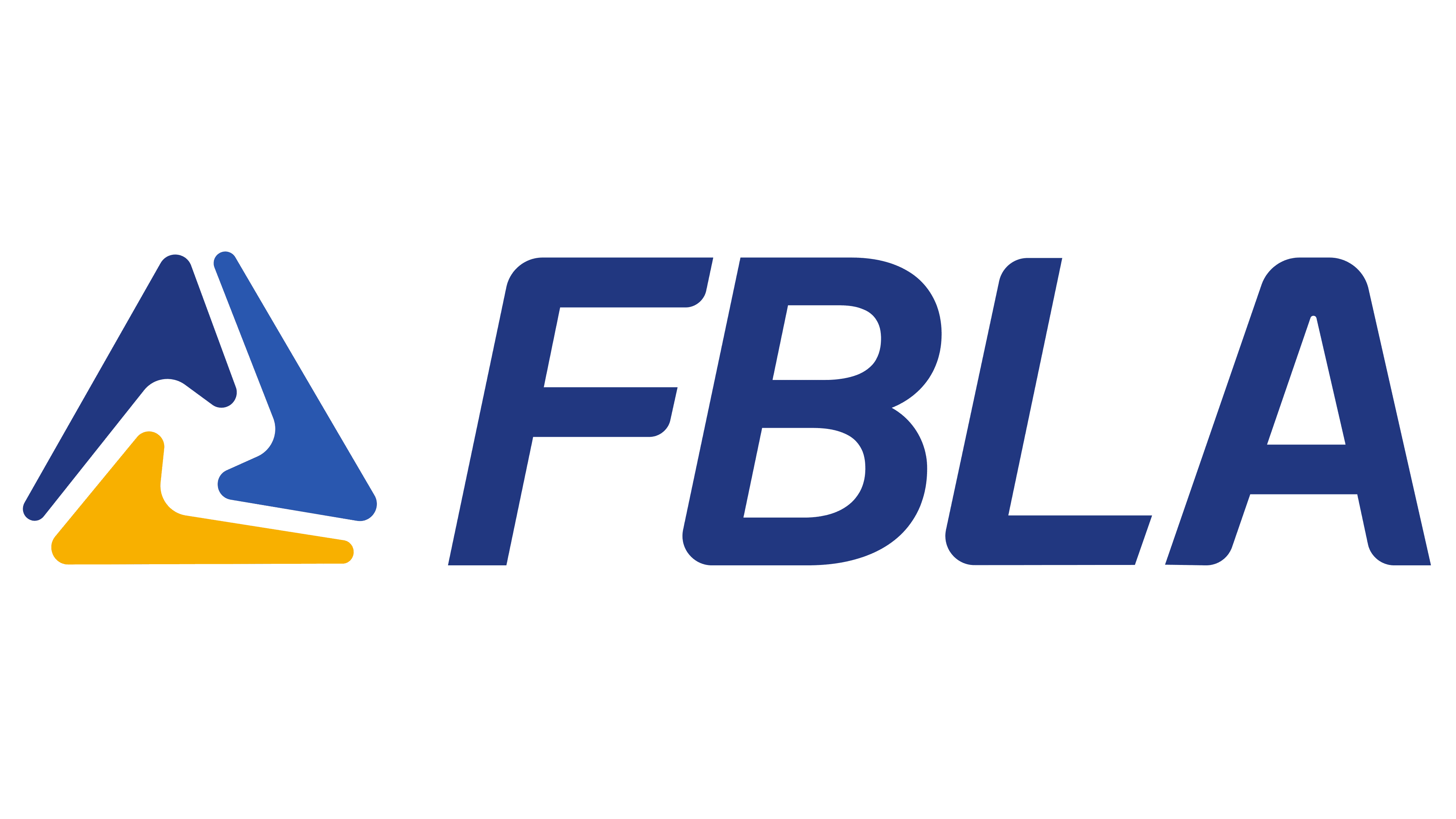
2022 – today
![]()
In 2022, a new emblem appeared, used alongside the previous one. The emblem consists of a triangle formed from three separate checks. The design has symbolic meaning:
- Represents the Greek letter delta. The underlying word for its name is “door.” The FBLA movement is a door to success and a path to a worthy income.
- Embodies the three educational levels in the program: middle school, high school, and university.
Displays the main qualities necessary for movement participants: leadership, freedom, and strength. It also represents the three main traits of a true leader: service, education, and progress. A blue abbreviation of the name follows the figure, with the full decipherment below: “Future Business Leaders of America.” The emblem looks very dynamic and well thought out.
Font and Colors

The logo is executed in the movement’s classic colors: navy blue and gold. The shades reflect perfection. Education within the organization improves its members and equips them with the knowledge to achieve excellent results in their future careers. The inscription’s font impresses with harmony and beauty. The smoothness of the lines aligns with the Apercu Pro family and underscores the importance of individuality, self-development, and character development in achieving success.