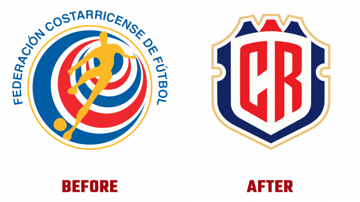
FCRF – Federación Costarricense de Fútbol, founded in 1921 as the governing body of Costa Rican football, has changed its appearance, presenting a new visual identity. She secured the country’s men’s national team entry into FIFA and participation in the world championships, helping to create the most successful team in Central America. FCRF overseas in Costa Rica all six leagues organized with its help, including UNAFUT, LIASCE, LINAFA, LIFUTSAL, LIFUPLA, UNIFFUT. The design agency Pupila from San José, Costa Rica, contributed to the development of the new style of the association.
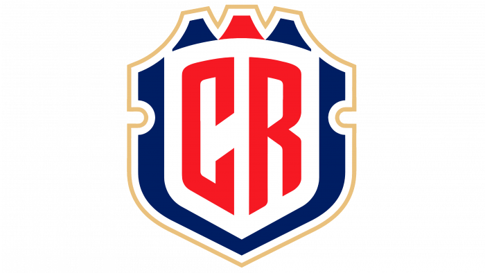
The new emblem was based on the state heraldry. The flag and coat of arms, shapes, and colors are taken as a basis. In modern processing, taking into account the achievements of digital technologies, the heraldic shield has acquired a more modern look, and thanks to the graphic symbolism – a special significance. The very first impression of the new composition is a real football emblem. Despite the absence of the image of the ball in it, its presence is felt. The coat of arms repeats the features of the national heraldic element down to its side recesses, as well as the upper decorative trim, which was only somewhat simplified and “modernized.” The top three prongs or stylized mountain peaks only add to the appeal.
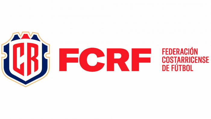
The color palette also carries a lot of informational content and is very readable in its thoughtful symmetry – blue-white-red-white-blue, playing with the colors of the flag. The monogram – CR, executed in the center, in large red letters, makes them an accent element and strengthens the confirmation of the belonging of the bearer of the emblem to his country. The graphic design of all elements with additional internal grooves provides three-dimensional perception of the entire emblem. The GT America font used for the abbreviation of the federation name creates a particularly striking contrast to the logo when used together.
This approach helped to solve another important problem – the separation of the visual identity of the National Federation and the national football team, which no one paid attention to for the past 30 years. The name change influenced the typography of the logo primarily. The new consistent visuality also provided new options for its use, both as an independent sign and in complex versions. Brand advertising looks especially impressive and at the same time solid when the logo is presented in multiple versions on one surface. As a result, the logo itself acquires the properties of a sign that can be worn by athletes and fans and by those who are true patriots of their country.


