Presenting the Ferrari brand to anyone these days is like pointing at a lion and saying it is the king of beasts. The world-famous sports car brand is the undoubted sales leader and the flagship of the European car industry. It is strength, power, endurance, and, most importantly – speed. For a long time now, the name Ferrari has become the common noun for high-class, reliable, and fast kind of driving.
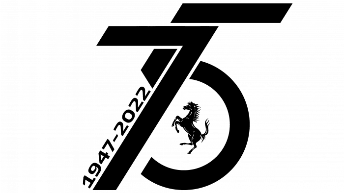
Preparations for the 75th-anniversary celebration were in full swing. Therefore, the new logo created on the celebration occasion was particularly impressive.
The symbol of the brand spirit is a horse that cannot be overtaken and cannot be thwarted on its way to victory.
The new logo is an emphasis on numbers. It is based on 75 years, stylized as an arrow going upwards and wheels as if symbolizing the road and cars on the line of seven, the dates of the brand’s active operations. In 1947 the production and operation of racing cars were started, so we can say that the figures reflect the historical way of formation of the brand.
In the part of the five, where the wheel is visually depicted, the famous image of a horse is hidden.
The brand representatives harmoniously and vividly expressed their dedication to their favorite cause. The monochrome and brutal, the elegant logo has an organic and majestic look, as it should look in such a solemn period.


