A new Staten Island Atlantic League professional baseball team called the FerryHawks is bursting into the sports scene to move the old-timers and pave their way to recognition.
It has become known that the team has secured the support of major investors such as Staten Island Entertainment, Yankee Global Enterprises, and other organizations to promote itself in the sports industry.
The naming was chosen through a complicated voting process. Among the favorites in the lead were DragonSlayers and HarborHeroes, which would eventually become part of the promotion schedule. Fans submitted nearly 2,000 names. In the final run, seven were selected, and three were left.
The plan is for the FerryHawks brand to become a magnet for tourists and fans. The stadium site is a neighborhood near the ferry with its colorful New York Harbor scenery. There’s a year-round sports and entertainment venue, professional baseball, amateur games, concerts, festivals, exhibitions, and other events that appeal to the public.
The brand’s mascot is a baseball hero and shows grit, dedication, commitment to the game, strength, and endurance. It is a new symbol of Staten Island, representing the geographical location and peculiarities of the region’s fauna. Red-tailed and copper hawk is a common and recognizable symbol for the islanders; that’s why visually, the brand’s designers needed to create a familiar atmosphere, convey the values and show a bright emotion, which the public could infect.
Megapositivity, energy, and in some ways even a manifestation of predatory and purposefulness – all this is embedded in the logo and identity of the team.
The slogan for the presentation of the new team’s image was a phrase from the general director Gary Perone – “It’s time to take off.” During the development of the identity, organizers emphasized a special role of the fans’ influence, without which the important decisions that influenced the further promotion of the team would not have been made.
The sports branding and custom design were handled by Skye Design Studios of New Jersey, professionals in their field.
In April 2022, the team will enter the arena and give heat to the opponents.
In the meantime, there is time to enjoy the team’s image and take a closer look at its graphic features.
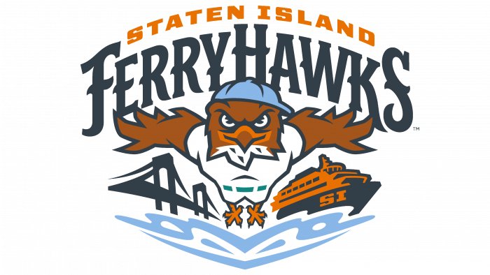
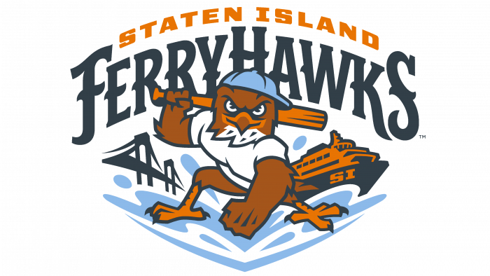
For instance, the logo has a very interesting font with a nautical theme. Letters look like the parts of iron constructions that are on ships or like the silhouettes of ropes with knots. There is a picture of the world’s most famous bridge Golden Gate and the ship, as symbols of the islanders. Cutting through the waves, a hawk in a blue cap and a white sports uniform flies. His “face” shows determination, seriousness, courage, and focus on winning. Above is the club’s inscription and the Staten Island prefix in orange.
To be more specific about the color scheme, dark blue, brown, orange, and blue are all logo colors. Not minimalism, but following the tradition of the best figurative logos in the sports world.
With such a symbol, you should not be afraid of your opponents. There are no comics, just confidence and uncompromising.
Great design work on the identity, which conveys all the love of fans of the sport.


