Over the years, Feyenoord has developed a logo tailored to the upcoming season, incorporating subtle but meaningful adjustments. Stichting Continuïteit (StiCo), the organization responsible for maintaining the club’s cultural ethos, has approved these initiatives.
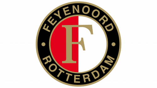
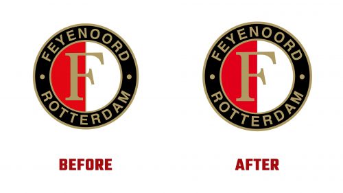
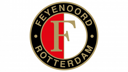
The revised logo includes four significant changes. First, there is a more straightforward transition between the words “Feyenoord” and “Rotterdam,” with the space between the letters consistently removed. This adjustment results in a more uniform and harmonious rendering of the text.
Secondly, the left side of the emblem now has a darker shade of red. This more intense color accentuates the enthusiasm and energy that the club recognizes. This decision also helps the logo stand out more in print and digital media.
Another significant change is repositioning the characteristic “F” in the emblem to be precisely in the middle. This repositioning ensures better balance and symmetry, creating a more visually appealing whole.
Finally, the golden dividing line between the white and red sections has been removed. This aspect returns to the original design’s foundation, as the emblem’s first iteration also lacked this feature. Removing the golden line gives the emblem a more straightforward and contemporary look while the text remains true to the club’s historical themes.
These changes are part of a broader update to the club’s visual identity being implemented this summer. While the initial visual elements of the new identity are already apparent, the full implementation process will take place over the upcoming season. The focal point of this operation will be the new shirt for the 2025–2026 season, featuring the revised logo.
The club has clarified that the adjustments were carefully considered and executed to strengthen and modernize Feyenoord’s identity. The renewed logo reflects tradition and progress, reminding the club of its rich history while providing a clear and unique visual representation.
The emblem has changed several times, most recently in 2008 and 2009 during the club’s 100th anniversary. The modern adaptations signify a new phase in the evolution of the club’s emblem, aiming to strengthen the organization’s visual identity in an era of increasing importance for visual communication and digital media.
The logo revision and broader visual identity are more than cosmetic changes. They reflect the club’s goal of positioning itself as a cutting-edge, professional sports organization ready for the future. By making the logo more streamlined and recognizable, Feyenoord strives to improve its brand consistency and create a stronger bond with its followers.
This distinctive visual identity will be visible across all club areas, from merchandise and stadium decorations to the website and social media accounts. The goal is to provide a consistent and recognizable brand experience that reflects Feyenoord’s values and ethos.
With these changes, the club makes a significant step forward, maintaining its rich history and traditions while innovating and modernizing. The new logo and visual identity reflect the club’s ongoing evolution and commitment to improving both on and off the field.


