Parkinson’s disease today is one of the big problems that require special attention. Affecting people of older and advanced age, it begins to “rejuvenate,” starting to manifest itself already among young people. In the fight against this disease, as well as the provision of new opportunities for people living with the disease, the company’s activity – Fight Parkinson’s is directed. The organization was founded in 1980. She devoted all her forty years of activity to protecting patients’ interests improving their quality of life. She makes special efforts to counteract the disease, which manifests itself at a young age. To increase its efficiency in 2021, the company conducted a wide survey within its community, seeking to answer an important question – what patients need from the organization itself. The in-depth brand research that followed led to the definition of a new overarching strategy, building a portfolio of visual elements for its sub-brands.
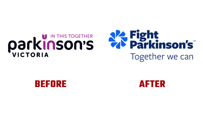
A strong visualization architecture was created to provide the required brand support. The beginning was laid with a new name characterized by simplicity and optimism. A slogan has been added to it, reflecting the current changes and the direction of the brand for the benefit of the community. These two elements – the name of the company and the slogan – Together we can, as well as the new brand symbol, have become the main part of the logo. The sign combines several abstract combinations of the letters “Ps” arranged in a circle. It becomes a symbol of a close-knit community of all who suffer from this disease. The overall architecture and design of the visual part demonstrate how the company effectively brings everyone together, regardless of their characteristics, medical histories, and situations, thereby forming a strong support organization. In parallel, the deep relationship between the services and care provided by the organization is demonstrated. The graphics and design of the sign create a visual effect of movement, the presence of energy created in the process of realizing its capabilities.
The color palette consists of several colors. The main one is bright blue – an optimistic color that symbolizes hope. The second is dark blue, used to visualize the wordmark, a symbol of professionalism and authority added to the brand’s voice, elevating the company to the level of an expert in users’ eyes.
The slogan opened up a whole new direction in messaging. It was a call to action, which strengthened the desire for unity and allowed patients to be reminded that they are not alone in their struggle.


