


![]() Firefox Logo PNG
Firefox Logo PNG
All the hot news is collected on the search engine’s pages, the logo promises. Thanks to the program, the user stays up to date on all important events worldwide. The emblem encodes the speed of opening new tabs and a beautiful interface.
Meaning and History
![]()
The history of the Firefox brand began much earlier than is commonly believed. The oldest “starting point” is 1994. Then a major new player emerged in the IT industry: Netscape. It introduced one of the first browsers but could not compete with Microsoft, adding Internet Explorer to every Windows software package. To show its edge, Netscape made the browser open, but even that didn’t help it.
In the late 1990s, the company and its main product were bought by the American media conglomerate AOL. Subsequently, Netscape members formed the Mozilla community to develop free software. The changeover had to be celebrated somehow, so Dave Hyatt and Blake Ross decided to release the Phoenix browser. They made a mistake with the name: it turned out the trademark already existed. The second option, Firebird, was also busy.
What is Mozilla Firefox?
Mozilla Firefox is a web browser developed by the Mozilla Foundation. It can be used on various operating systems. It is one of the most popular browsers, valued for its flexible settings, high security, speed, and convenience. It was created in 2004 as an alternative to Internet Explorer.
As a result, the creators had to name their project Firefox after the tiny red panda. By the way, she is depicted on the browser logo and not a fox, as everyone thinks. The brand’s original visual symbol appeared in 2004. Over time, it has hardly changed: the designers only slightly simplified the design and increased the picture’s brightness. As a result, the image lost many details and became more colorful, a trend central to many companies’ identities.
The iconic round icon helps the browser compete against web giants like Google Chrome and Safari. Recent events have shown that, due to a global redesign, it could lose a significant part of its target audience. As far as we know, in 2019, Mozilla introduced the Firefox logo without an animal or a globe, featuring only a red-orange half-ring. It was designed for a parent brand that offers many services, from the Lockwise password keeper to the Send data app. At the same time, all products have their logos, including the browser.
But the public did not understand the changes: social media users made a fuss, deciding that Firefox would no longer have “foxes.” They were loudly outraged and created thousands of demotivators, so the Mozilla representatives had to make excuses. So it turned out that many Firefox fans don’t even know what the program’s icon looks like now.
2002 – 2004
![]()
In 2002, the Phoenix browser was developed. Its visual symbol lived up to its name: the designers depicted a red bird whose feathers resembled tongues of flame. Her tail and wings seemed to be on fire, in keeping with the legend of the phoenix rising from the ashes.
But trademark issues forced the owners to rename their project. For several months, it was called Firebird, and the icon has not changed since then. Subsequently, it turned out that this name was already taken by one of the Internet services.
2004 – 2005
![]()
In 2004, Firebird became Firefox, although the name was also adopted. At the same time, the browser needed a conceptually new logo because the old one no longer matched the theme. The Mozilla branding team was created specifically for this purpose. The initiator was Steven Garrity, who proposed to rename the project. He represented the interests of the software development company Silverorange.
Just before Christmas, Steven brought Jon Hicks to the team to visualize all the ideas. The first concepts were proposed right on holiday because the deadline expired on January 2. The best option came up with Daniel Burka. Stephen Desroches created a black-and-white sketch that became the basis for a full-fledged logo.
Jon Hicks designed the final image using Fireworks MX tools. First, he drew the icon at 128×128 pixels. He then reduced it, simplifying the shape and removing unnecessary details until he got a 16×16 format for displaying the browser on the taskbar. This symbol was used in Firefox 0.8 and 0.9.
2005 – 2009
![]()
A new logo has been created for Firefox 1.0. In a modified version, the animal’s tail became more yellow, and more light spots appeared on its body. The pointed ends of the ears and nose softened slightly. The globe was repainted a bluish-blue and acquired a barely noticeable glow.
2009 – 2013
![]()
When Mozilla Firefox 3.5 was released, users saw a new icon. The so-called fox has become darker and more voluminous due to the contrast of colors. The drawing on the globe has changed. A large light spot appeared at the top of the logo, and an elliptical gray shadow appeared at the bottom.
2013 – 2017
![]()
In 2013, the image was smoothed: the developers removed many details and applied a gradient to soften the transitions between shades. Only the tail remained multi-layered.
2017 – 2019
![]()
In 2017, the design was simplified as much as possible. The detail has diminished to the point that the animal’s outline is blurry. Only the elongated silhouette in the form of a semicircle, wrapped around a three-dimensional blue ball, has survived. The gray shadow at the bottom has disappeared, and the colors have taken on brighter hues.
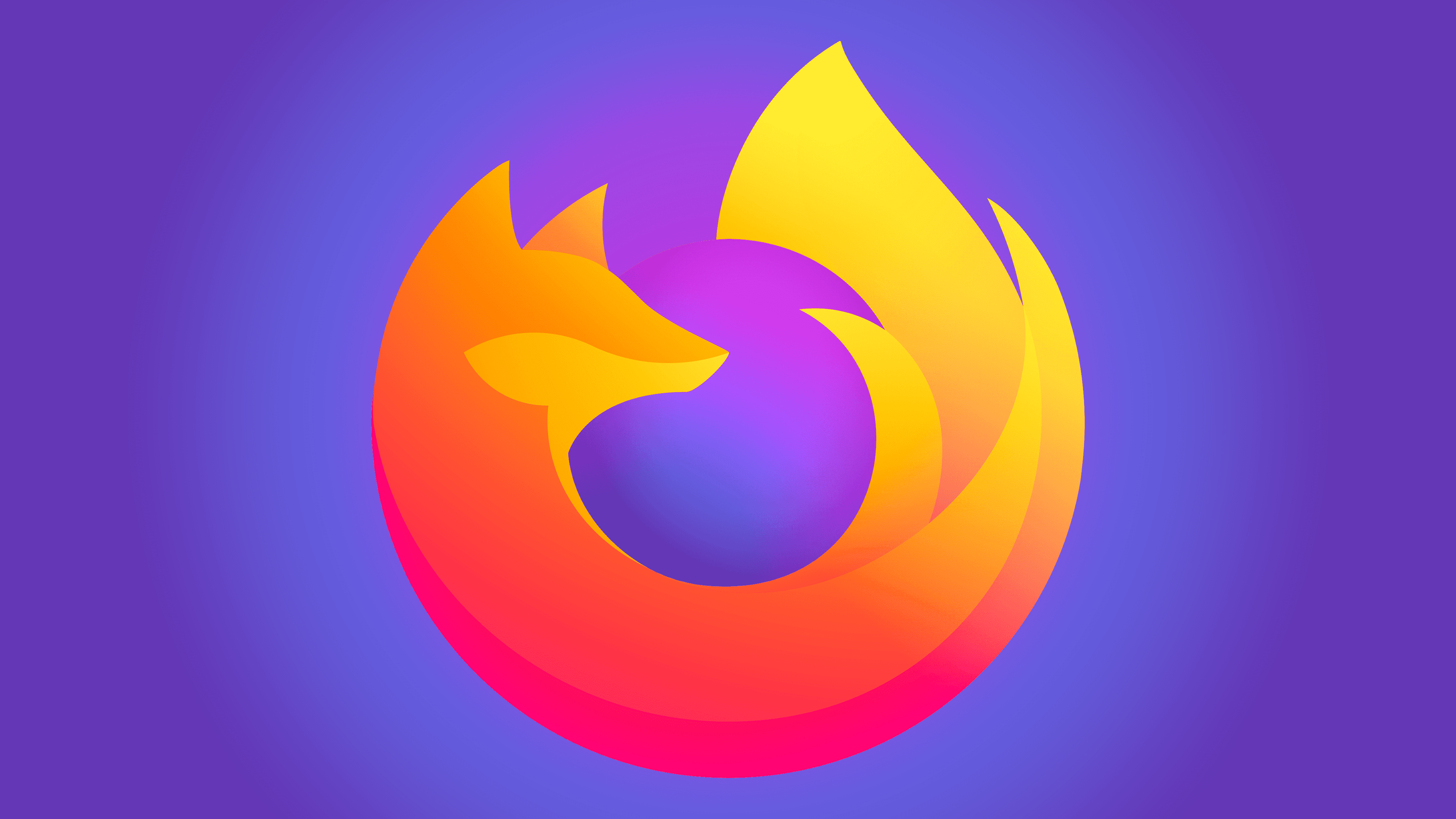
2019 – today
![]()
Eighteen months before the logo change, company representatives conducted a study to determine what the new logo should look like. In the process were Michael Chu of the San Francisco agency Ramotion (responsible for the parent brand identity for the entire Firefox product line), Jon Hicks (creator of the first logo), and Michael Johnson of Johnson Banks (consultant and creative inspiration for the designers).
Together, the team developed the logo, which was presented in 2019. The concept has remained almost unchanged, but the image has become simpler, with many details removed. The central circle has shrunk and acquired a blue-violet gradient, and the animal’s head was turned to the right and positioned in profile.
Font and Colors

Few people know that the fox is not represented on the Firefox icon. This is a miniature panda, which is called a Firefox in English. It looks like a red long-tailed raccoon, which is reflected in the browser emblem. It is not in vain that the animal bends around the globe: such flexibility testifies to the software’s adaptability and globality.
There are no inscriptions on the logo, but there is a very colorful image of a red panda and a globe. The use of colors such as orange, yellow, dark pink, purple, and blue creates interesting dynamics, especially in a gradient.