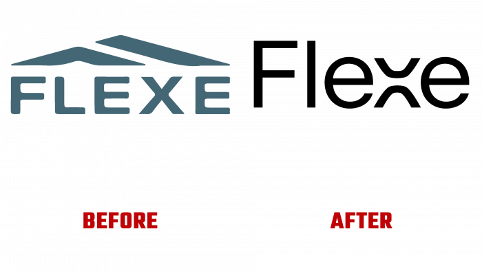
One Design Company has unveiled a new identity for logistics electronics company Flexe, established in 2013 in Seattle, WA. The company provides e-retail services, ensuring that purchases are dispatched on the day of payment and a constant expansion of the offered capacity based on Fortune 500 data. The service involves the use of modern technologies, open multichannel logistics networks, and elastic economic models. The brand’s capabilities are spread all over the world, making its offerings the most versatile. This is especially effective when there are high volume sales of goods, as Flexe provides warehousing, organization, and delivery directly to the consumer. The brand’s mission is to manage orders, inventory, all operations, and transportation and analytics.
At the initial stage, it was determined that all industry areas have some common trends. It was possible to stand out in something only by avoiding common techniques. It was necessary to consider in detail the knowledge and experience of the company, based on which it turned out to find outstanding features and unique moments. The logo based on the name has become an original solution in white text on a black background. The highlight was a kind of solution in the form of a double letter “x,” which became a demonstration of two industries combined into a single whole, logistics and technology. In addition, visually, the “x” fits very well into the gap between the two “e,” directing the flow of the current space directly to the “x.” The letter on the website looks successful even as a small icon that provides readable typography on every page.
Accents highlight the selected color palette. All tones correspond to the physical world of logistics – metallic gray, black tires, brown packaging, as well as red markers and exit signs. The basis for the construction of visuality was a technical scheme, which is common for logistic profiles based on unique paths, intersections, intersections, and many levels. The website has embodied certain characteristics by presenting the dynamics of multichannel logistics. The logo and identity came to life in intellectual adaptation. This was reflected in both the design and functionality of Flexe, her team.


