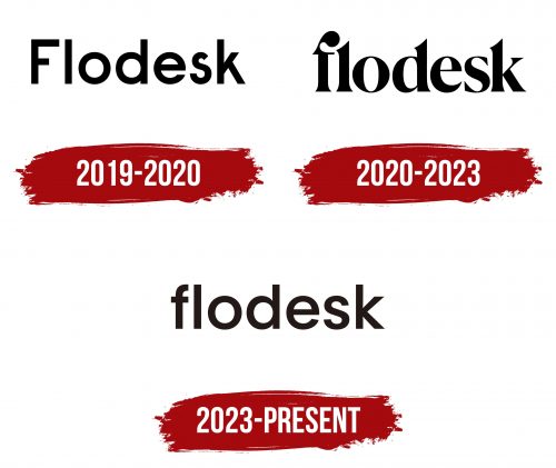
The Flodesk logo was recently redesigned to embody the platform’s accessibility for a broad spectrum of digital business users. While retaining its textual format, the emblem now opts for a much simpler aesthetic. It features a typeface with exceptionally smooth letters free from ornate and sharp serifs. Employing a chunky font reminiscent of Qanelas Semi Bold, the text is lowercase. This dovetails with the platform’s concept of broad accessibility. The black glyphs exude a sense of seriousness while ensuring good readability.
The choice of a simpler design serves a purpose far beyond cosmetic appeal. It signals a demystification of digital business tools, highlighting the platform’s intent to make them accessible to everyone. Smooth letters, devoid of intricate serifs, emphasize a user-friendly environment. They signify that the platform isn’t just for experts but is an inclusive space welcoming everyone, irrespective of their level of tech-savvy.
Using lowercase letters adds another layer to this message of universal accessibility. Lowercase is often perceived as less formal and more approachable than uppercase. This supports the notion that the platform is not an exclusive club but an open community for all digital business enthusiasts.
The chunky font, similar to Qanelas Semi Bold, complements these elements by providing a modern, bold look. It reinforces the platform’s authority in the digital business sphere while keeping the focus on user-centric design and accessibility. Flodesk knows that the seriousness of business doesn’t have to come at the expense of style or readability. The black glyphs convey this balance, giving a straightforward yet polished look.
The emblem succeeds in accomplishing its mission of communicating broad accessibility without compromising on style or clarity. Its various design elements collectively convey the message that there is a tool designed with the user in mind. It prioritizes form and function, mirroring the platform’s core values of inclusivity, approachability, and user-friendliness.
Every detail, from the choice of color to the font type, is a calculated move to align with the platform’s ideology. While aesthetically pleasing, the logo is a visual handbook explaining what the platform aims to achieve: a harmonious blend of business seriousness with user-centric design. It not only stands as a brand identifier but also as an emblem layered with meaning, precisely capturing the essence of the platform’s goals.
Flodesk: Brand overview
| Founded: | 2019 |
| Founder: | Martha Bitar, Trong Dong, and Rebecca Shostak |
| Website: | flodesk.com |
In 2019, Martha Bitar, Rebecca Shostak, and Trong Dong joined forces to create Flodesk, aiming to offer an uncomplicated yet powerful email marketing solution geared toward small enterprises and individuals involved in creative fields. Unlike other startups that rely heavily on external funding, the trio opted for bootstrapping their venture. This approach proved successful, attaining $10 million in annual recurring income.
Setting itself apart from competitors, Flodesk prioritizes aesthetics in email marketing. The platform specializes in visually appealing email layouts and templates. The user-friendly interface is intended to assist novices in navigating the world of email marketing while still including advanced features for more experienced people.
Though the company secured a modest amount of seed funding from angel investors in 2020, most of its financial backing has been self-generated. By 2021, the platform boasted a clientele exceeding 10,000 who utilize its services, including email composition tools, transaction pages, and automated marketing utilities.
Despite being based in San Francisco, Flodesk adopts a remote-first work culture, employing a team scattered around the globe. The platform continues to expand briskly, drawing in an increasingly diverse group of users—these range from entrepreneurs and individual proprietors to social media influencers and creative professionals.


