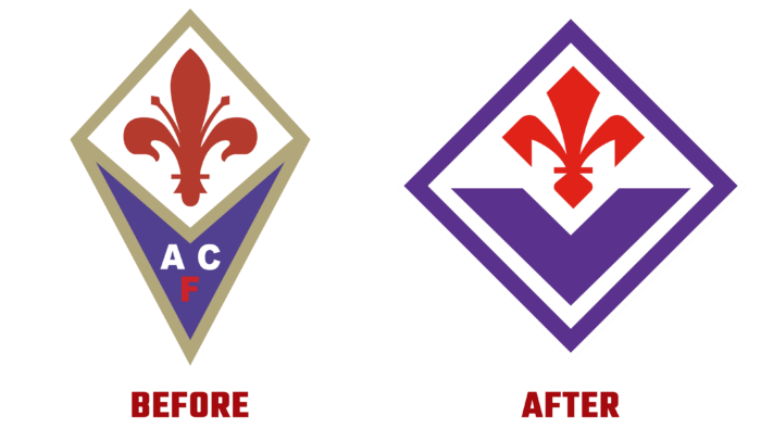
On August 29, 1926, the history of the two-time Italian champion of the Florentine club ACF Fiorentina began, which presented its new emblem this year. For 95 years, the brand has experienced ups and downs and reached unimaginable heights and depths of disappointment. But he always remained true to his history, the city, and the fans, strictly observing the basics of his team philosophy. The club’s proudly presented new logo will be used in the upcoming season, becoming the first manifesto to be implemented. It reflects a new identity, the brand’s deep roots, promising the game’s identity, the authenticity of football, and its indispensable closeness to people. At the same time, the identity reflects all the beauty of the region, the passion, and the nonconformism of the spirit of the Florentines, striving with high ambitions for a football renaissance. The essence of the new strategy and identity is reflected in the slogan – PLAY TO BE DIFFERENT.
The club’s logo for the new season will demonstrate a change in views on football, reflecting the new tactics and personality of the game, the commitment to be proud of its diversity, to be different, alternative. At the same time, it is an obligation to restore the beauty and purity of football, its honesty, and humanity. The identity represents a close connection with the city, symbolized by the central element – a red lily marking its glorious historical past. But the modernized version of the heraldic element can go back to the founder of the club – Luigi Ridolfi, who devoted a lot of time to the heraldry of the club.
The graphics are based on past versions. All the best is used, but emphasizing the infallibility of the lines, improving with the use of modern technologies for the possibility of high-quality presentation in digital format. The modern logo provides for its use in limited spaces with poor visibility and refreshment.
The harmony of the visualization is ensured by the thoughtfulness of the composition, in which the red line is supported by the letter V in purple, the cult color of the team. It is recognizable and loved by all fans, which is why this central element of the logo has become a symbol of the union of all Viola. This symbol will feature prominently in the architecture of Viola Park.
All these changes ensured that the club became a global brand, distinguished by its uniqueness, abundance of values , and rich history. And it is directly related to one of the most beautiful cities in Italy. The club’s future-oriented emblem demonstrates its ability to win hearts and the desire to be a source of inspiration for the wide and diverse community being created.


