There is such a civic commune, Fontaine-le-Comte, located in the Grand Poitiers part of the urban community. In recent years, the population in that area has increased, so there is a great need to improve conditions and create a cozy oasis for the growing generation.
The quality of life in the commune cannot be called low, but it is a part of the rich city in its green space and historical heritage. A place that was looked after looked after, fertilized and appreciated, and appreciated to this day. Nevertheless, people are still accustomed to comfort, and if there is a need to improve something and the ability to implement their plans, then why not.
The French are such aesthetes… An area is a charming place, a historical luxury, also supported by the magnificent Abbey of Augustine. You can also find boutiques, local shops, and just lovely places. What an ideal geographical position for admiring nature, architectural highlights, developed infrastructure! New opportunities are opening up, business horizons are expanding, and the population willingly accepts innovations and admires historical wonders.
The visual identity of Fontaine-le-Comte was given to the transformation of Graphéine. It was the right decision because the only experience can create a truly stunning logo and color match.
The identity of the city has been reimagined. They breathed new life – colorful, fresh, like a sip of water, at the same time sweet, tender, and gentle note of sensuality and melancholy. Everything that the local French so appreciates has been transferred to visual solutions.
Rejecting the role of a “sleeping city,” new energy burst into those lands like the waters of a fountain, and the image of Fontaine-le-Comte became amazing.
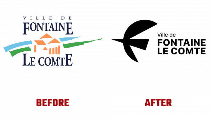
Previously, the logo was like a marker painting by a minor artist. Bright blues and greens, orange for rooftops, and an overly formal serif font. This is certainly not “comme il faut” by the standards of the present time.
The name alignment appeared – Ville de FONTAINE LE COMPTE. Moreover, the geographical name itself is written with capital letters in a different font – more bold and clear. The graphic element, meaning a bird, or rather a swallow, symbolizes calmness and at the same time encodes the letter F in the name of the place.
A unique icon gives an understanding of hidden meanings, for example, a bird – a symbol of freedom, vigor, and serenity; she portends spring, brings warmth, and joy—generally a positive and safe image. Nature is the region’s heritage, being a green haven, ideal for recharging hard-working people who do not want to indulge themselves in pleasure and at the same time reconnect with their natural surroundings. Culture is another key brand message. Through the influence of the work of Henri Matisse, the desire to recognize uniqueness and creativity, expressed by a new identity, is expressed.
Rebranding has become a real gift for the population, and now people can enjoy the beauties created by nature and the creation of design ideas.


