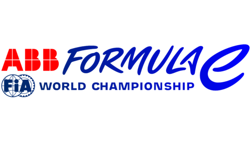
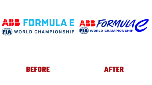
Ahead of the Gen3 generation era, the ABB FIA Formula E World Championship announced a change in visual and audio identity. The next season of the competition will be released under a new logo, which is radically different from the one used previously. The organizing committee announced this at the end of November 2022.
Both branding and TV graphics will change, as well as the soundtrack of the races. They were used for ten years, and now they are waiting for a complete reboot for the convenience of the fans. The changes will start with digital assets and gradually cover other elements:
- websites will be relaunched during the next year;
- then the applications will be replenished with extended functionality.
At the heart of the new emblem is the Torque Loop. She represents the energy and excitement that serves as the foundation of the sport and the brand. The management statement also states that the source of the upgraded logo is a self-sustaining cycle. He also inspired the designers for the typeface. That is, the torque of electric acceleration is the basis of modern identity. The updated badge reflects the important role of sport as it is a key catalyst, the impetus for accelerating the technological improvement of electric vehicles.
The higher the acceleration activity, the more often new fans appear and the faster this sport is popularized. As a result, humanity progresses. And all this – in the latest Formula E logo, where smooth lines prevail over hard corners. The glyphs are jerky but rounded, like the trail of a car that has just passed. To emphasize the categories, the developers increased the lowercase “e,” making it much larger than the uppercase letters.


