The pandemic has affected many brands, and the new logo allows for a different look at the studio and refined brand.
The Studio Output design studio developed the new logo. The companies have a lot in common; Found Dan Moore’s director previously worked at Studio Output. Before the outbreak of the pandemic, companies were even located together in the same office.
Studio Output analyzed aspects of Found’s operations and created a beautiful logo and a cohesive visual identity. The font for the brand name was selected according to all current trends. Conciseness, simplicity, incompleteness – what modern users love. Some letters are incomplete, but the fact does not affect the readability of the text.
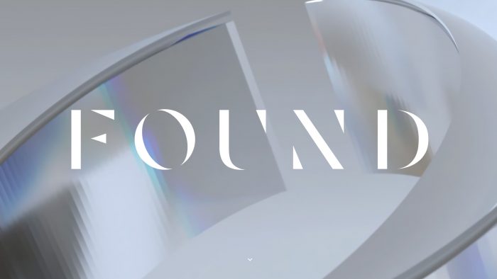
Found specializes in 3D motion design. Taking advantage of this fact, Studio Output added 3-D shapes and played with light and shadows. You can see the 3D shapes made in noble gray and white shades. Also, there are colored highlights in the upper corner, and the elements of the image themselves are outlined with the correct shadows.
Found has also moved to the cloud due to the pandemic and uses Google Workspace, the design studio says. It was important for the team to create an image that would look harmonious both on the website and in presentations.
Speaking of the website, the design studio decided to add a “Studio” section where employees can share stories of finding inspiration or describing an idea’s path. Even in online work, there is a large human factor, and to bring users closer to the company, artists and designers will be able to talk about their creative experiments.
The rebranding goal is to create lightness, ease, but at the same time a clear position. The new logo is associated with the title of the magazine. The designers used simple elements, but they got a good result by combining modern and basic elements.


