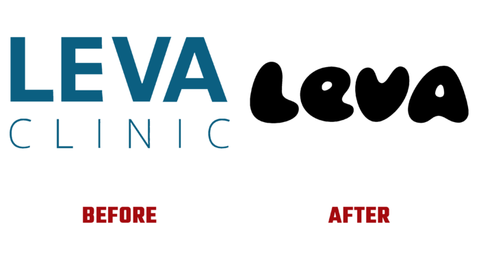
Having begun its useful and necessary work in 2020, Leva Online Clinic has renewed its identity, which was developed by That Thing, London. The new style has become a more effective reflection of the brand’s characteristics and its mission. The online platform offers personalized care and treatment services for persistent pain. When creating the service, the company’s specialists carried out extensive research, which became the basis for this new treatment model. The technique includes a set of measures and tools that combine physiotherapy, psychology, and drug treatment. Access to the platform is open to all English people over 18 years of age. The platform accepts treatment in the presence of pain – in the back and joints, in cancer and fibromyalgia, in the nervous and the pelvic region, abdomen, and sciatica.
The development of the new style was started with a new strategy that had a unified start to the website and mobile applications. Everything was focused on the characteristics of existing patients, taking into account possible deviations in new ones. The work done has ensured the creation of a distinct personality with the possibility of further developing world-class services. The created product was named “360 Car” and combined three categories of treatment, which were defined according to the severity, importance, or urgency – Mind, Movement, Meds. These categories have become tools that facilitate the work of medical teams, making it easy to make individualized treatment planning and documentation.
Each created symbol of the graphic system of individualization has become a reflection of this triangular product and the obligatory formation of the patient’s program in the new treatment model from Leva. This also affected the logo itself, which was quite unexpected in its graphic design as a representative of a medical brand. It does not appear to be associated with any brand peculiarities, does not have a contextual reflection. But this is what makes it unique and attractive. The original approach to creating letterforms is based on three healing aspects – mind, healing, and movement. It is the form that attracts the eye and makes the composition easy to remember. Some of their “plumpness” creates a visual softness. The roundness of the shapes only enhances the effect, creating a soothing atmosphere that is especially suitable for a brand in this category. At the same time, the text is created easily readable in all formats of its presentation due to the clarity of execution of each element, line, attention to every detail.
Warm gradients and diffused aura in the performance of the color scheme effectively symbolize caring and the obligatory achievement of positive results through gradual and gentle actions brought to life by the company’s specialists.


