MyAdbox was founded in 2010 and has evolved into a strong independent brand called Sesimi. It is a versatile and powerful platform for using branded content provided by various companies. The service allows to carry out all the processes correctly, according to the competent scheme of brand management.
Based in Australia, the company operates as a SaaS business. Clients are offered two products – the management of digital assets for storage and sharing, in addition to the technical implementation of the creative expression through the automation of assets, creating layouts for any media format.
The brand renewal is because the company decided to expand and grow in a new image, to become more attractive to investors and clients worldwide.
Thanks to the creative office of SomeOne, which is also located in Australia (Sydney), we got a design and a fresh brand image, which at the same time shocked by its simplicity, causing confusion, outrage, and perplexity of the experts.
The brand promotes the idea expressed by Arthur C. Clarke’s – any sufficiently advanced technology is indistinguishable from magic. So every aspect of the brand, including the new naming, has taken on new meaning and its new reflection.
Creativity, which is revealed through Sesimi’s tools, is a key figure in the company’s activities. It is the focus of the audience’s power, which becomes a finished product thanks to the work of the service. Everything the client needs to communicate his brand to his target audience, visualize values, and acquire new formats of activity – this is what Sesimi does.
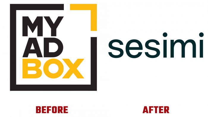
However, no matter how well the brand is regarded as an industry leader, the new design is disappointing. The new logo does not stand up to criticism compared to the old logo.
Where is the creativity? Where is the zest? Where is the association with the line of business? All there is in the new logo – a black font without a hint of specialization. Some designers believe that an elegant and simple logo references the individuality of the request in a digital environment. The client will see for himself what he wants, depending on his objectives. A logo is definitely a plus because it doesn’t “pull the blanket” or catch the eye. The brand’s product is the foundation, not the flashy picture. In this case, the opaqueness of the logo becomes a plus.
At least there used to be two colors – yellow and black. The logo itself looked like a square with letters inside that were embedded in three stories. Indeed, what was written in the square was expressed by the square itself – the box, that’s the key concept around which the design was built.
What will happen now after the rebranding is hard to say. The logo will likely be changed to a more interesting variant after some time because this looks very boring, as a simple headline with a hundred letters. The font has no distinguishing features.
A cool marketing ploy, though, is possible. Dissolving into a world of colorful graphics, the Sesimi logo will attract the audience with its seriousness and monotony because in a world with too much bubbling information, it’s respectful to stay out of the mainstream and out of the loud fashion.


