In 2017, John Bonnell, David Orr Gaucher founded Wholly Veggie, headquartered in Toronto, Canada. The brand focuses on the preparation of plant-based frozen foods and snacks. The manufacturer offers easy-to-prepare meals that are high in protein. The important characteristics of the proposals are health safety and minimization of harm to the environment. The brand promotes its products throughout North America. You can also buy frozen food in Whole Foods, Farm Boy, Metro, and others. To improve consumer feedback, the brand rebranded this month with the help of the professional Public Address team based in Toronto.
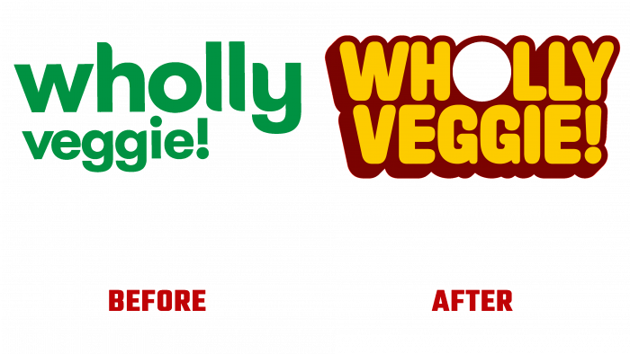
Starting to develop a new image for a product brand, the design studio studied in detail the features and strategy of the company. Her food is simple, safe, and interesting enough. Starting with the logo, we got a kind of window in the letter “O” into the world, distinguished by beautiful and healthy food. That everyone dreamed of. Everything in it aims to provide quality food, which is very beneficial for everyone and does not harm our planet. In short, not “vegetable”, but simply “vegetable”.
Inspired by the ingredients themselves, the designers decided to apply a fresh palette of a rather pleasant reddish-brown hue, making it possible to bind to various other vibrant colors that blend and blend wonderfully. As for the text, it’s done in a short, rounded sans-serif typeface. The vibrant color palette and thick shade make it eye-catching, memorable, and undeniably distinctive in the plant-based frozen food category. The “W” and “V” corners have been neatly aligned for a nice tapering effect. The letter “Y” is centered with an exclamation point.
And finally, a circular letter “O” was placed between the two letters “G,” making it possible to use it as an additional visual element, depending on the products in this package.
To make its products more interesting and seductive, Wholly Veggie doubled its visual impact on its new packaging, making it very colorful, confident, memorable, and hard to ignore.


