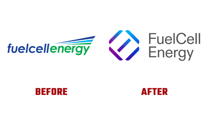
One of the largest fuel cell manufacturers in the US, headquartered in Danbury, Connecticut, public company FuelCell Energy has changed its visual identity. Founded in 1969, today, it designs, manufactures, operates, and services molten carbonate power plants. This technology is an alternative to traditional combustion-based power generation, becoming an effective complement to intermittent power sources such as solar and wind. Over the years of its existence, the brand has become one of the largest producers and suppliers in the US of clean energy, supplied to more than 50 countries worldwide. The brand operates the world’s largest Gyeonggi Green Energy fuel cell park in South Korea and the largest park in North America. The brand covers commercial and industrial enterprises, municipalities, and educational institutions, constantly expanding its customer base with its services. The ongoing changes in the development of the brand, one of the main objectives of which was the pursuit of zero carbon emissions, are reflected in the recently introduced new corporate identity.
The desire to lead humanity into a carbon-neutral future has become the main goal of the brand’s development. The new visualization was formed to signal to customers, communities, and employees about the company’s absolute commitment to providing a safe, reliable, and practical approach to achieving the set goal. The new brand reflects the energy platform’s purpose, functions, and features. The created design, built on three reference points, determines the path which the company follows. Initially, the use of color gradients was introduced as evidence of the passage of the path to the goal. The minimization of visual elements and reflection systems symbolized the reduction in the area of the design system, which confirms the seamless implementation of clean energy. The color scheme was chosen in such a way as to reduce the visual toxicity of the impact on the viewer, which led to the abandonment of the previously adopted corporate green color.
The whole identity was inspired by the large and positive history of the company, which offers universal fuel cells running on biogas and natural gas, as well as their mixtures with hydrogen. The design was based on the effect of molecular bonds that break down to create a different chemical reaction.
The unique typography in the form of letterforms, including FCEL, has become a spectacular stock sticker. Its development has provided an accent element in the growth strategy, demonstrating a redoubling of efforts to achieve the set goals.


