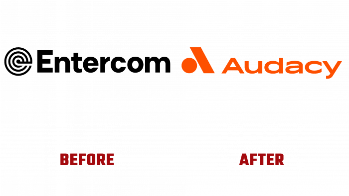
Entercom Communications Corp, one of the leading commercial radio broadcasters, announced its urgent renaming and full rebranding. The decision was made under the influence of cardinal changes in the corporation’s activities. Over the past three years, Entercom has been introducing new technologies that have expanded its capabilities. The scale of these changes has ensured the formation of several platforms related to creating music content and entertainment programs, making the company a leader in the American broadcast market. Having covered the entire audio market from music programming and podcasting to news and sports, the corporation realized that it had “outgrown” Entercom, created more than 50 years ago.
The fundamentally new company, born based on the corporation, received its original name – Audacy. This choice was dictated by the complete correspondence of the name to the spirit and goals of the renewed company, the originality of the sound, as a homonym for the word “odyssey,” and the attractive “audacity” of the abbreviation – AUD. These three letters became the new stock code in April 2021. At the same time, its digital platform, Radio.com, was closed, and a new website, audacyinc.com, was launched.
When developing the new identity, animation was applied that represented the equalizer element at the time of its functioning with voice acting. Three dynamically moving “bars” of equalizer frequencies under the musical chord pass into the main element of the logo – the stylized letter “A” from “Audacy.” Its right leg is formed by one of the equalizer bars, freezing at an angle. A circle is placed under it, providing a visual perception of the sign, just like a letter. However, it is rather difficult to call this concept a unique solution. On the net, you can find a lot of similar symbols that have one or another slight difference from this option, but repeating the general design – an oblique with a dot forming the symbol “a.”
Under this symbol, the full name of the updated brand is placed, made, like the sign itself, in the same rich orange color – cinnabar. For the name, the font type Kinetica Bold is used. Composition – sign + name are made in such a way as to make a figure in the form of an isosceles pyramid, the base of which is the name, and the sign forms the rest with the top.


