Thirty years have passed since the creation of Fundación arteBA – the largest organizer of contemporary art fairs in Latin America. The brand is headquartered in Buenos Aires, Argentina, where it develops and manages fairs, focusing on the development of art in its own country and throughout Latin America. To celebrate its 30th anniversary, the brand undertook a complete rebranding of the company in conjunction with Santiago & Nicolas. The changes affected all areas of the company’s visual identity – fund, communications, logo, and website, which reflected all the information on preparations for the 2021 exhibition. At the same time, the new identity reflected all the internal changes that have taken place over the years and the prospects for further development, which became possible thanks to the use of modern digital technologies.
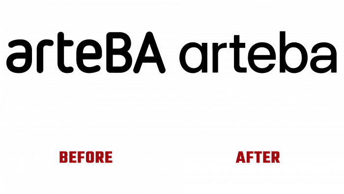
First of all, the changes affected all typography. This was reflected in the new interpretation of the graphic design of the name. The textual name was retained, which successfully connects the direction of the brand and the company’s hometown. But the emphasis in the previous logo on the city only has been removed. Today it was important to expand the scope of the territory voiced by its activities, to shift the emphasis to the concept of a fair for all cities in the region. A sans-serif typeface was chosen to create an atmosphere of softness and an all-encompassing appreciation of creative success—two letters “a” made in different styles. One is thin, reflecting a rebellious spirit, which directly binds the brand to the contemporary art it reflects; the other is thicker, which realizes the idea of uniting various artistic movements under one brand in the unity of the composition. The result was a modern, laconic, but maximally informative logo with good readability and memorability.
No restrictions were made on the color palette. The mass of shades and colors has become a reflection of the endless variations of colors used in a wide variety of art forms, including musical ones. This made it possible to create a unique visualization of the website. Three parallel columns were used on the main page, providing the opportunity for several works, galleries, masters at once. An imitation of the feelings of a pioneer is created, which each person feels when they first visit the fair in real-time at the place of its holding. It also provides a comfortable opportunity for communication between creators and viewers.


