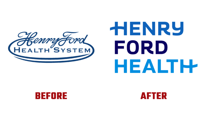
In 1915, Henry Ford decided to justify a new health care system – Henry Ford Health System, which received his name. Based in Metro Detroit, it opened a corporate office located at One Ford Place, Midtown Detroit, Michigan. Over the 107 years of its existence, the non-profit organization has gained trust and location not only in its region. Today, it provides emergency, specialized, primary, and preventive care backed by cutting-edge research and specialized state-of-the-art staff education. Keeping up with the times and forming the Health Alliance Plan, the organization’s board of trustees decided to rebrand, which led to simplifying the imaging system and a name change.
In an effort to dynamically develop and reduce the information overload of its identity, the brand abandoned the word System in the name. Thus, emphasis was placed on an important moment for the organization – the word Health, which is fundamental to the company’s strategy. The new identity demonstrates the brand’s deep commitment to its partnership with every patient and community. It also points to making the most of your abilities and your entire workforce along the difficult path to Health.
The logo’s construction and the entire design’s construction provide a visual unification of all the company’s offerings – from primary and preventive care to comprehensive services provided, including at home, pharmacies, and retail. The main emphasis is placed on the academic mission to promote research and educate the next generation of highly qualified specialists. The new visualization has become an effective platform for dynamic storytelling, the opportunity to share your personal stories, hopes, and resilience with partners and community members. At the same time, the typography and color palette were focused on connecting individual stories to reinforce the mission and promises of triumph and inspiration. Here are the thrilling stories of a pregnant COVID patient undergoing a double lung transplant to a nurse practitioner housing her patient.
Shades of blue were chosen as the main corporate colors – saturated dark and light, in which two words of the wordmark are executed, separated by a black contrasting execution of the founder’s surname. Thus, the emphasis on the figure of the founder was ensured, and the brand’s founded philosophy was formed – the pursuit of endless health care, constantly improving its capabilities. The new signature pays homage to the organization’s powerful heritage, providing a bold new look.


