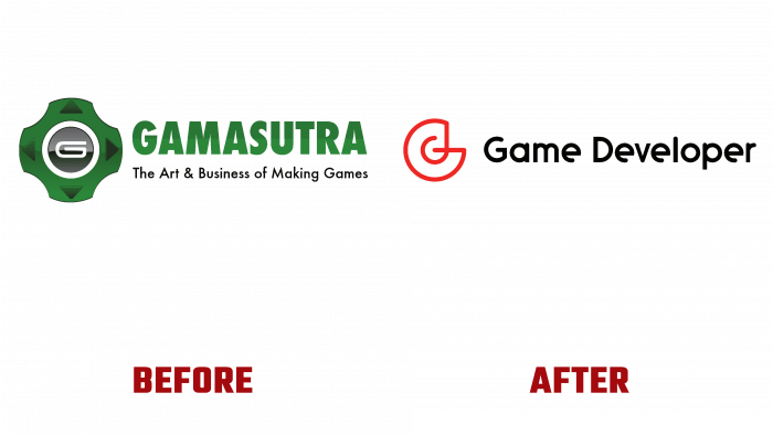
More than 25 years ago, the Gamasutra resource was formed, which was to help developers of computer games. Today the time has come that requires from the resource not only the availability of important, necessary, and useful information but also the obligatory formation of an attractive, memorable image, designed for the impeccable visual perception of the identity by the modern user. The desire to grow and develop further, reaching an ever-larger audience, demanded radical changes in its own visual identity, starting directly with the change of the resource’s name. The use of the achievements of modern technologies in typography and the digital sphere, taking into account the peculiarities of the psychology of the current consumer, formed the basis for the creation of a new logo, the development of a name, and a complete change of the corporate identity.
The name change was a response to the “sidelong glances” of many users. And given the peculiarities of the perception of information by Generation Z, there are even more of those who do not understand humor and the essence of the internal content of the name. The new name – Game Developer, does not require much mental stress to understand what is behind it. It’s simple, easy to read, and easy to remember. A minimum number of graphic elements were used in the logo to enhance these effects – a sign and a new brand name.
The sign has become a symbol of the resource and is used in conjunction with a text name and independently on icons and icons in digital and printed versions. When developing it, the requirement for simplicity of visual understanding of its essence, focus, and maximum visual information was considered. At the same time, his graphics should not have been difficult to understand and overloaded with elements. The sign is made in the form of an interweaving of two capital letters of the words of the brand name – “G” and “d.” Its symbolism lies in the unity and direct interconnection of everything that offers a resource for the possibility of obtaining effective solutions to the problems of creating games. The letter G is the basis of the sign. A stick of letter d is continued from its upper end, the circle of which crosses the middle line G and ends strictly in the center of its free field. The bright red color of the symbol makes it an accent element of the logo.
The name following the symbol is made in a font similar in type to Diameter Rounded Bold, with rounded endings of the letter “l” and incomplete lower “tails” of the letter “e.” This incompleteness attracts the eye and does not let go until the full visual coverage of the entire inscription of the name. The use of black color provided the convenience of placing the logo on all elements of the promotion, providing clear visual perception and ease of reading the text.


