Plant-based frozen desserts brand revolutionizes visual identity and adds vibrant imagery.
Coconut Bliss was founded in 2005, and this is the fourth logo change in its history. The brand is known for producing quality products with all the certifications of conformity to standards. All desserts are gluten-free, GMO-free, and 100% vegetable. The company sells its products in the United States and exports sweets to Canada, Australia, and Germany.
Agency Gander has shared the details of cooperation with Coconut Bliss. According to the team, the company’s target audience has expanded significantly from just vegans to just about everyone. The brand was able to structure communication in such a way as to show the bliss of eating dessert, even if it is not made with traditional ingredients. The designers decided to bring the idea to life and show that you can enjoy a delicious dessert no matter what your age or occupation.
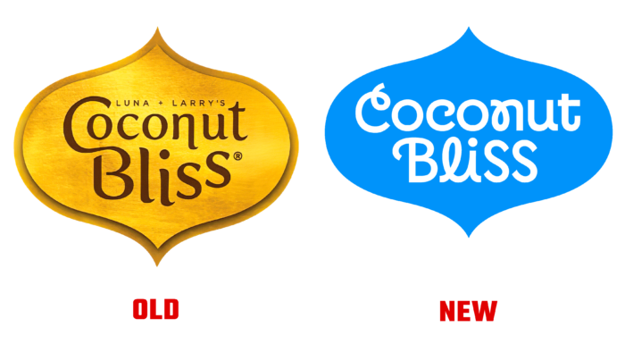
After 16 years on the market, the company has developed a very minimalist, harmonious design. The radical decision on the part of the designers has significantly refreshed the brand. Pay attention to the beautiful font. Some letters are stylized in an unusual way, for example, “C” and “n” – they look harmonious and easy. The logo is significantly different from previous options, which were replete with graphic elements, textures, and even add text like the founders’ names in the 2019 image.
The visual identity of Coconut Bliss now also consists of colorful pictures created in collaboration with Olimpia Zagnoli. The characters are very unusual; I wonder if all consumers will like them. Heroes are complemented by funny names, for example, Mint Chip Galactica or Golden Banana Swirl. In this way, the brand demonstrates the main idea that their ice cream is suitable for any consumer.

You can see characters with the names of desserts on the packaging, made in bold Sharp Type Centra # 1. The new packaging is such an explosion of color, especially in comparison with the previous versions. Full faces of the characters can be seen on ice cream buckets, and for other products, designers have created hands holding desserts. They are made in the same style and look bold and interesting. Coconut Bliss has gone beyond the usual framework and rebranded, worthy of attention.


