


![]() Gap Logo PNG
Gap Logo PNG
The simple and brief Gap logo represents the world’s third-largest clothing store chain. The visualization’s concise lettering style reflects the brand’s philosophy and reveals its hidden meaning: a generation gap.
Gap began in 1969 after Donald Fisher failed to find Levi’s jeans in his size. On August 21, 1969, he and Doris Fisher opened a store in San Francisco near a university campus, investing $63,000. The concept combined a full range of Levi Strauss & Co. jeans with records, aimed at youth culture.
Early growth relied on a simple retail idea. The “wall of jeans”, proposed by Lou Romanello, organized sizes clearly. Sales grew, and by 1973, the company went public and started developing its own denim to reduce reliance on Levi’s.
By 1980, Gap had hundreds of stores. In 1983, Mickey Drexler became president and ended sales of third-party brands, focusing entirely on Gap products. That same year, the company acquired Banana Republic and repositioned it to appeal to a more affluent audience.
Expansion continued with GapKids in 1986 and BabyGap in 1990. In 1987, Gap opened its first international store in London, followed by its first in Canada in 1989.
In 1993, a major advertising campaign helped define the brand’s image. In 1994, Old Navy launched as a mass-market label, competing with H&M and reaching $1 billion in sales within four years.
Rapid expansion led to issues by 2000–2001, with declining sales and losses. Drexler left in 2002, and Paul Pressler became CEO. In 2016, Gap reorganized its portfolio across Gap, Banana Republic, Old Navy, and Athleta.
In 2020, plans to spin off Old Navy were canceled. Donald Fisher died in 2009, leaving a global retail network spanning more than 90 countries.
Meaning and History
![]()
Although all Gap logos contain the same short inscription, they look completely different. Thanks to the design team, the first version is radically different from the last.
What is Gap?
This is a U.S.-based company that produces casual clothing that is associated with the traditional American casual style. The focus is on using comfortable materials and creating versatile designs for the entire family. The product range includes jeans, T-shirts, sweaters, and jackets that are easy to mix and match. Jeans, hoodies, and T-shirts with distinctive design elements have become iconic staples of a basic wardrobe. The clothing lines feature specialized collections for children, offering stylish and practical options for all ages.
1969 – 1976
![]()
The opening emblem consists of two words: “the” and “gap”. They are written in lowercase letters with serifs, where “g,” “a,” and “p” are circles of the same size with lateral strokes, and “t” resembles a cross and is connected to “h.” The article “the” is placed at the top at an angle.
1976 – 1986
![]()
After a minor update, the logo looks different. The designers emphasized the first word, aligning it horizontally and bolding the letters. As a result, the spaces between “t,” “e,” and “h” were reduced so much that they began to touch at the extreme points.
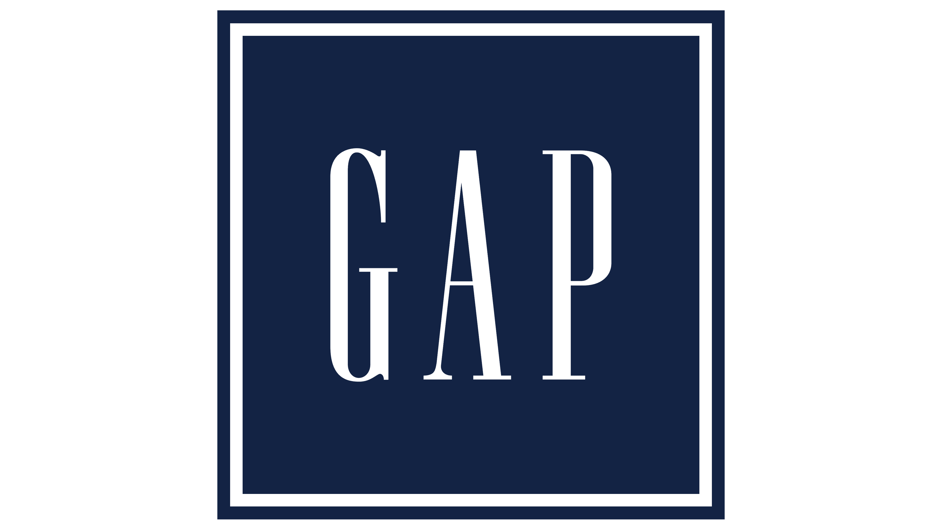
1986 – 2016
![]()
In 1986, a sign called the Blue Box appeared. This time, the creators placed the inscription in a blue square. The word “GAP” is written in capital letters, stretching upwards and adorned with short serifs. The article “the” disappeared and did not reappear, symbolizing the years 1976-1986.
2010
![]()
In 2010, another attempt was made to change the corporate style, but it was unsuccessful. Customers criticized the bold “Gap” inscription with a blue square in the upper-left corner. This logo was used for only a week, from October 4 to October 11.
2016 – today
![]()
Six years after the unsuccessful redesign, the company introduced a new logo. The developers simply removed the geometric figure behind the word “GAP,” thus changing the design of the 1986 logo.
Font and Colors
The corporation’s trademark embodies minimalism. It reflects the essence of Gap by containing only the store chain’s name, without unnecessary decorative elements.
The font used in the logo is generally similar to Ann Pomeroy’s Spire Regular. It is an adapted version, as the designers worked with serifs and stroke weight.
The color palette is as minimalist as the logo’s structure. Previously, before 2016, there was a large dark blue square behind the inscription; now the background is white. The word “GAP”, on the other hand, is black.
FAQ
What does the Gap logo mean?
The logo with the inscription “GAP” represents the brand name, which is deciphered as “generation gap.”
Why did Gap change its logo?
Gap changed its logo because it considered its branding outdated. It wanted something new.
When did Gap change its logo?
The last update of the Gap logo occurred on January 1, 2016.
Who developed the unsuccessful Gap logo?
The New York creative agency Laird & Partners developed the unsuccessful Gap logo.