The Postobón brand recently introduced a fresh take on its image. The logo change took place for the first time since 2004 when the main graphic symbol of the brand was fixed.
According to the well-known fizzy drink maker, the new image of Sodas Postobón, which is the flagship of the brand’s products, is more flavored, more expressive, and simple. The image seemed to be “humanized” and became closer to the consumer, which increased his popularity due to the positive emotions that the product itself carries.
The smile that formed the basis of the design concept always carried a joyful mood. But really, what other sensations can there be if you like a product, both by its taste properties and by its appearance?
The main thing to emphasize here is that small bubbles are not just a carbonated drink but whole fireworks of emotions and taste.
The commercial history of the brand has been dragging on for a very long time, so they wanted to leave the historical heritage in the new image and not change the visual design too drastically. Just make it a little modern and innovative, paying tribute to the conservative traditions of production.
According to the initiators of the rebranding, the consumer figure should be at the center of the design. That is, everything that should be reflected in the design is the buyer himself, who with all his character could at any moment be involved in an interesting adventure, adventure, holiday that Postobon products carry.
The new image of Gaseosas Postobón was created in collaboration with the agencies Aldasbrand and Sancho BBDO. Approximately 1,300 consumers have evaluated the brand renewal concept in major cities across the country through in-depth surveys and interviews.
We can say that the impression of the new brand image is positive, and the buyers were happy to accept the changes.
The logo has become more modern and minimalistic.
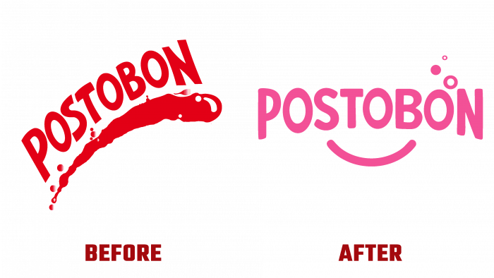
Suppose earlier there was a three-dimensional inscription as if created by embossing, white on a reddish-pink background. In that case, these are white letters stretched in a light arc under an insignificant degree. In addition, with three bubbles, one of which plays the role of the letter O. The smile as a symbol now is an image of a soda spill, a wave located under the logo’s typeface. Previously, the logo was more voluminous and sophisticated. Still, the new look has simplicity and conciseness, even, one might say, the ordinariness of the design of letters with contour figures.
The smile-arc looks quite simple, but this is the power of the logo. It conveys the idea of closeness to the customer, reflects the very figure of the customer, his loyalty to the brand, and the joy of the purchased product.
Overall, the new logo looks completely different from the previous one, but the earlier version also looked decent.
With a revision of current design trends, market analysis, and current technology, it became clear that the brand lacked a modern accent. The simplicity of the symbols and type becomes the hallmark of the Postobón brand and increases the company’s awareness. With a new look, the brand is waiting for a new surge of energy within the company and new “waves” of streaming sales.


