2018 was a critical year for Gawker, a site for the latest news and cool gossip. The bankruptcy led to its closure and the sale of the Bustle Digital Group. After almost five years, the founder of BDG and its CEO Bryan Goldberg decide to relaunch the resource in a completely updated format and changed corporate identity. But the launch planned for 2019 did not work out due to staffing problems. Many were critical of this attempt. Especially after a fiasco, the former owners tried to make a second restart of the portal just before the lockdown. Leah Finnegan, who previously worked with this resource from 2014 to 2015, also did not feel much enthusiasm and expectation of prospects for the site’s development. However, Bustle was able to convince her to take over the editing of Gawker in her editor-in-chief role. As a result of her consent, a staff of employees was recruited, which had a huge impact on rebranding and reviving the portal. This moment turned out to be very interesting – all the editors, authors, and writers who came were women. And it was their vision of the updated resource that formed the basis of the updated Gawker.
The content of the new portal has not undergone significant changes. He retained the main sections – News, Politics, Celebrities, Media, Technology. Several more have been added to make the site more lively. The functionality and design have undergone significant adjustments. He became less vulgar and more attractive. A profitable symbiosis of the rigor of modern minimalism, which reflects the new logo and the cheerful, playful, sometimes insane design of the updated portal, adds zest to this cake of “sweet” news and gossip. This “change of scenery” really benefits Gawker, which became noticeable in increasing visits and subscribers.
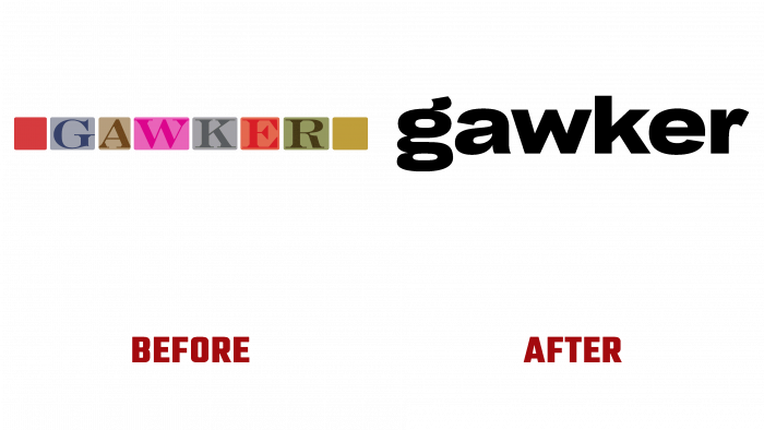
The new logo is specific and expressive. It is made with a claim to aristocracy and grotesque at the same time, which was facilitated by the Body Grotesque Large Extra Bold font, somewhat modified by the designers. Monochrome execution-only black color, as well as nothing superfluous “around” and “near,” enhance this effect, which is a direct reflection of the essence of the portal itself; it’s a way of selecting and presenting the information. This approach to forming a new style gives hope that Gawker will indeed find a long second life with the appropriate selection of content.


