The Canadian brand General Assembly Pizza (“GA Pizza”) knows how to make pizza a real property of the American nation alone. Their frozen pizza has won the reputation and respect of customers in the company’s name and is an extremely tasty frozen product that is easy and quick to prepare in a limited time.
Initially, it was just a frozen semi-finished product, made with love for the client. Then the company decided to create a whole system of monthly “subscriptions” for ordering pizza if anyone wishes. The catch is that the pizza does not stay in the refrigerator for a long time, and then it is brought to the customer. On the contrary, it is freshly prepared, kept cold for a certain amount of time, and then it is brought under the buyer’s door.
Ali Khan Lalani, CEO of the brand, notes that the idea for a new visual design and the desire to rebrand arose during the COVID-19 epidemic when many small and large businesses decided to rethink their strategies to change living conditions.
The company involved true masters of their craft in the development – View Source (the agency that was tasked with creative and web design), Maven (retail), and Suech & Beck (everything related to photography). The authors of the rebranding emphasized that the task is to embody “takeover,” customer interest in pizza, since pizza lovers can be found at every turn, and the GA Pizza brand has become unimaginably popular in the era of rampant coronavirus. The brand began to communicate at a new level with the buyer; they began to value and take more interest in them; therefore, it is necessary to increase production capacities and expand horizons with visual solutions.
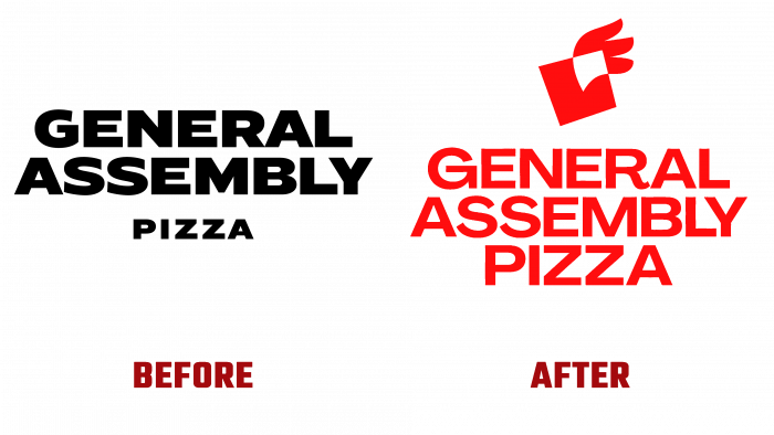
In the near 2017, the brand started rapidly, and this dynamic continues to this day. However, the black and white logo with the name and below the word “pizza” (smaller size of the same sharp square font) did not distinguish the brand from its competitors.
The logo is now improved and brighter. The logo, which had in the concept a pizza with wings meaning flight, height, new horizons, is called “Levain.” This name was given the nod towards the company’s mission – to delight the pizza lover. A slice of pizza with square wings symbolizes packaged products that inspire and inspire in these difficult times of economic collapse.


