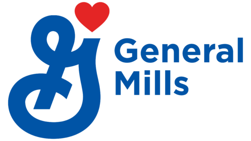
The General Mills logo consists of the wordmark and the iconic Big G symbol, originally appearing on cereal packaging. Since 2017, a red heart has been depicted in the upper corner of the letter – evidence that the company does everything with love.
General Mills: Brand overview
General Mills owns brands of cereal snacks, food products, baked goods, and breakfast cereals. He appeared in the USA and was originally engaged in flour production. As the industrial enterprise grew, the assortment expanded and became famous worldwide.
General Mills began in 1866 in Minneapolis, Minnesota, thanks to Cadwallader Washburn. It started as a wheat flour mill. A few years later, Washburn and his partner, John Crosby, created a better way to produce high-quality flour. This innovation led to the construction of the Washburn “A” Mill in 1877, the biggest of its time. It could produce enough flour for 12 million loaves of bread every day.
In 1928, the company became General Mills by acquiring three breakfast food companies, including the maker of Gold Medal flour. This began General Mills’ venture into breakfast cereals, starting with Wheaties and Kix in the 1930s and branching into the ice cream sector.
During the 1940s and 1950s, General Mills introduced cereals like Cheerios, Trix, and Cocoa Puffs. It also expanded into frozen foods and animal feed. The 1960s and 1970s saw the company grow by acquiring toy companies such as Parker Brothers and Kenner Products and launching restaurant chains like Red Lobster and Olive Garden.
In the 1980s and 1990s, the company concentrated on food and beverages, parting ways with its restaurant and toy divisions. Lately, General Mills has shifted towards healthier foods by purchasing natural and organic companies like Annie’s Homegrown and EPIC Provisions. It also meets the demand for organic and gluten-free products.
Now, General Mills serves over 100 countries and owns famous brands like Cheerios, Häagen-Dazs, Pillsbury, Nature Valley, and Yoplait. The company stays ahead by following food trends and leading in the industry.
From its origins as a flour mill to its status as a worldwide food powerhouse, General Mills has focused on innovation, strategic acquisitions, and meeting consumer preferences. With a continuous interest in nutritious and sustainable foods, General Mills aims to remain influential in our food choices, whether a bowl of Cheerios or a Nature Valley snack bar.
Meaning and History
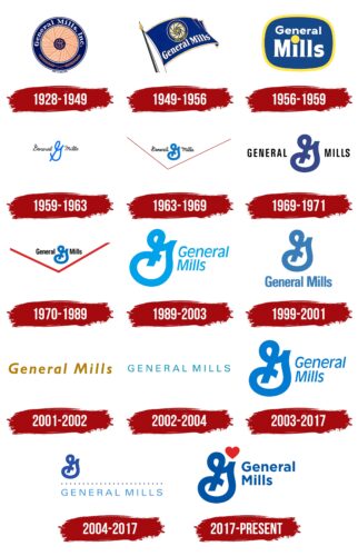
The first logo of General Mills was a reflection of the background of this company. It was created based on several flour milling companies that united around the large Washburn-Crosby plant, which dates back to the mid-1800s. General Mills appeared in 1928, and its emblem featured a mill wheel. And over time, the iconic Big G badge was developed.
What is General Mills?
General Mills is an American company operating in the food industry. Its predecessor is a flour mill founded in the mid-1800s in Minneapolis. Flour is still included in the manufacturer’s assortment, but now it is not the main product. The company focused on semi-finished products, canned food, bakery, and confectionery products.
1928 – 1949
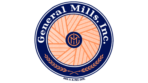
The designers stylized the mill wheel by turning the blades and arranging them like flower petals. This part of the composition consisted of many orange and white stripes. In the center was a small navy blue circle monogrammed in orange “GMI.” The same dark blue ring served as a frame for the logo. It contained two ears of wheat at the bottom and the white inscription “General Mills, Inc.” at the top. For the phrase, a flattened bold font with long serifs was used.
1949 – 1956
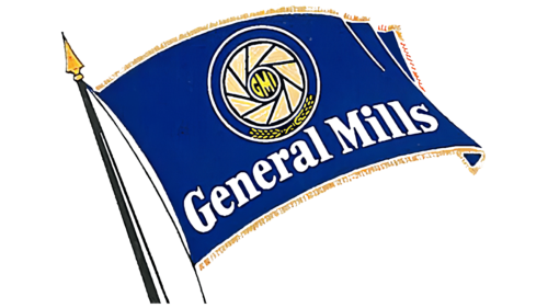
In the late 1940s, the mill wheel was on a large dark blue flag with a gold border. The orange color has been changed to yellow. Solid triangles were used instead of “striped” components. Where there used to be a monogram, there were separate letters “G,” “M,” and “I.” The waving flag added dynamics to the logo. It was attached to a flagpole with a sharp arrowhead.
1956 – 1959
Since the company, among other things, produced television programs, it decided to stylize its logo to look like a TV screen. As a result, the base has acquired the shape of a rectangle with rounded sides. It was dark blue and was inside a yellow frame. Inside was the brand’s name, for which they used bold white letters with short serifs. The dot above the “i” looked like a large yellow circle.
1959 – 1963
In 1960, the first version of the so-called Big G appeared on the packaging of Twinkle’s cereal. This icon was often featured in cereal advertisements, where it was said that “G” stood for “goodness.” The letter was depicted as one thin, light blue stripe with loops and curves. It was between the black words “General” and “Mills” in the same thin handwriting.
1963 – 1969
Edwin Rawlings, president of General Mills, decided to give the company a clean and simple logo similar to the Big G on a cereal box. To do this, he turned to Lippincott & Margulies for help. The designers have strengthened the shape of the “G” by thickening the blue line evenly, making the curves more rounded, and shortening some parts. The font of the black inscription has changed accordingly, and a large red check mark has appeared at the bottom.
1969 – 1971
There was an emblem variant with a dark blue Big G symbol and the bold Roman lettering “GENERAL MILLS.” The brand name was in uppercase letters without serifs, and the checkmark at the bottom was missing.
1970 – 1989
It looked like an analog of the version used throughout the 1960s. It featured the words “General Mills” in bold sans-serif, with only the first “G” and “M” in uppercase. The red bottom tick has become wide.
1989 – 2003
The shape of the Big G gradually changed: the logo developers slightly tilted this graphic sign to the right. The company’s name appeared on the side and was divided into two lines. It used bold sans-serif italics. All elements were painted light blue.
1999 – 2001
Big G is straight again. The phrase “General Mills” was moved down one line. The designers gave it back a straight, bold font. The blue color has taken on a dull and dark azure hue.
2001 – 2002
A gold wordmark with “General Mills” appeared and had wide letter spacing. In this case, the bold italic font was used. The Big G symbol was missing.
2002 – 2004
There was also a logo with the company’s name written in thin and even capital letters in blue.
2003 – 2017
The enlarged Big G sign was on the left, and the phrase “General Mills” was on the right. The brand name was split into two lines and consisted of italic glyphs.
2004 – 2017
This logo appeared after the company bought the Pillsbury trademark from Diageo in 2001. The Big G has taken on a navy blue hue, the same as on the former Pillsbury emblem. At the same time, a strip of 24 points appeared under it, which was taken from the same place. She symbolized development and growth. Below that was the light blue name of General Mills.
2017 – today
After the redesign, the company’s logo featured a large bright red heart that took over the right side of the Big G. The row of dots disappeared, and the phrase “General Mills” became the same deep blue as the stylized letter. Now, it is on the right side and, in an old-fashioned way, is divided into two lines with a left alignment.
The Big G sign symbolizes durability and strength by itself. It is also a tribute to many years of tradition and a reference to General Mills. The red heart reflects the company’s passion for food production and the customers’ love for food.
Font and Colors
The font for the General Mills logo is Gotham Bold, created by typographer Tobias Frere-Jones. The current navy blue is from when the firm borrowed it from Pillsbury. The gloomy palette is diluted with a bright shade of red.
FAQ
What does the General Mills logo mean?
The General Mills logo, known as the “Big G,” debuted in 1960 on a box of Twinkle’s cereal. This “G” was designed to help General Mills shine in the cereal market, representing their promise to deliver top-notch products. They introduced the slogan “The Big G stands for goodness” to show their commitment to offering high-quality cereals and making breakfast better for families. This logo played a key role in their marketing, appearing in TV ads and printed materials to emphasize their commitment to quality, setting them apart from competitors.
What color is associated with General Mills?
In 2017, General Mills introduced a new logo created by Lippincott, featuring a blue “G” alongside a red heart. The blue symbolizes the company’s commitment to trust and reliability, indicating its dedication to serving its customers faithfully. The red heart, conversely, signifies warmth and the company’s focus on producing quality food that conveys care and affection.
The combination of blue and red in General Mills’ logo represents the company’s core values: a blend of trustworthiness and a warm, caring approach to bringing families together through delicious, high-quality food. This logo communicates to customers that General Mills prioritizes offering nutritious and high-quality products, helping the brand to distinguish itself on store shelves and maintain its esteemed position in the competitive food industry.
Is General Mills a US brand?
General Mills, located in Minneapolis, Minnesota, near its original founding place, is a well-known American brand with a long history in the country. It has expanded globally, offering products under famous names like Cheerios, Pillsbury, Betty Crocker, Nature Valley, Old El Paso, Blue Buffalo, and Häagen-Dazs. These brands collectively generate over $18.1 billion in sales around the world. Despite its global reach, General Mills deeply identifies as an American company.
What is General Mills’ mission statement?
General Mills wants to improve our lives by offering foods that are good for our health, simple to prepare, and tasty. They make their food healthier by reducing sugar, eliminating artificial stuff, and adding good nutrients. This helps us enjoy yummy food that’s also good for us. They create foods that are quick to make, like breakfast items and snacks that fit well into our busy lives. General Mills aims to make eating a fun part of our day. They’re dedicated to improving our health, giving us more free time, and making us happier with what we eat.
What is General Mills’ main product?
General Mills is a big name in the food industry, known for its variety of cereals and baking products. Popular brands under General Mills, like Betty Crocker and Pillsbury, make baking easier for everyone with products ranging from cake mixes to cookie dough.
Cereals from General Mills, including Cheerios, Trix, Lucky Charms, Count Chocula, and Cocoa Puffs, are not only for breakfast. They are loved by children and adults alike and have become a part of pop culture.
Besides, General Mills offers other products that people love. Annie’s is known for its organic and natural foods. Nature Valley offers healthy granola bars and snacks. For those who love ice cream, Häagen-Dazs provides rich, creamy flavors. These brands show how General Mills meets the tastes of treat lovers and those looking for healthier food options.
Is General Mills successful?
In 2023, General Mills had a fantastic year, according to their CEO, Jeff Harmening. The company achieved significant growth, with its sales increasing substantially. This uptick in sales demonstrates their ability to thrive in the competitive food market. Remarkably, they surpassed $20 billion in sales for the first time. This milestone indicates that General Mills is on a successful path, effectively expanding its reach and satisfying customer needs. Their growth and sales achievements reflect positively on the company’s strategies and the range of brands they offer, highlighting their strong position in the food industry.
