 Geosource Energy, a leader in the realm of geo-exchange technology, has launched an updated logo, signifying a pivotal shift in its brand identity. Since its inception in 2004, the company has been at the forefront of delivering innovative geo-exchange solutions. The introduction of the new logo mirrors Geosource Energy’s ongoing commitment to revolutionizing energy systems through sustainable practices.
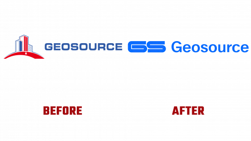
The original logo, which depicted an electric plug extending beneath a building, was a direct representation of the company’s core operation – harnessing the Earth’s stable subsurface temperatures for efficient heating and cooling solutions. While effective in illustrating Geosource Energy’s primary services, the previous logo adhered to a more literal and conventional design approach.
In contrast, the new Geosource Energy logo adopts an abstract and modern perspective. The design is anchored by a distinctive “GS” monogram, drawing inspiration from the drilling grid patterns characteristic of Geosource’s geo-exchange installations. This monogram subtly alludes to the complex and detailed nature of the company’s technological processes, with elongated lines reminiscent of deep-earth drilling. The monogram’s sleek and refined style embodies both contemporary design aesthetics and a sense of technical precision.
Complementing the monogram is the company’s name in Dinamo’s Walter Neue typeface, a choice that enhances the logo’s overall geometric look. This typeface adds an element of sophistication and underscores Geosource Energy’s dedication to innovation and technological advancement.
The logo’s adaptation across different platforms is thoughtfully executed, maintaining simplicity and effectiveness. Various arrangements of the monogram and wordmark ensure versatile yet unified branding across multiple mediums. The color scheme, featuring shades of blue and black alongside black and white photography, reflects the company’s robust and industrious ethos.
The Geosource Energy logo represents a significant evolution in the company’s branding strategy. More than just a visual update, it encapsulates the essence of Geosource’s advanced geo-exchange technology and reflects a more polished and contemporary corporate image. This rebranding exercise is a clear indication of the company’s resolve to continue leading in the field of sustainable energy solutions, showcasing a commitment to innovation and environmental stewardship.


