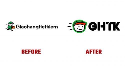
Established in 2013 as Giao Hàng Tiết Kiệm, GHTK has been a key player in Vietnam’s logistics and delivery sector. Recently, the company debuted a new brand identity developed by Ho Chi Minh City-based M — N Associates, showcasing a significant evolution in its visual presentation. This update revitalizes GHTK’s appearance and supports its ongoing mission to offer innovative delivery solutions to a diverse clientele ranging from small businesses to large online retailers.
GHTK has shortened its name to streamline its brand, making it easier to recognize and remember. This adjustment is designed to enhance the brand’s appeal and improve user engagement, particularly targeting small and medium-sized businesses and individual retailers throughout Vietnam.
The new logo takes inspiration from elements deeply rooted in Vietnamese daily life, such as the motorcycle wheel and the intricate network of roads and alleys depicted on city maps. These symbols reflect the dynamic and rapid environment in which GHTK operates, emphasizing the company’s core operations in logistics and delivery.
At the heart of the new identity is the “Confident Smile” icon, a symbol intended for seamless use across digital platforms. This icon represents the reliability and satisfaction GHTK strives to deliver, embodying the positive impact of efficient service on both shippers and recipients. It conveys a sense of joy and assurance that resonates with the experiences of its users.
The previous logo featured a whimsical delivery person, notable for its playful and rapid movement. While this design was charming, it lacked the sophistication needed to represent the company’s capabilities. The new logo retains this playful essence but introduces a modernized depiction of a delivery person’s head, complete with a stylish cap and a friendly smile. However, the simplicity of the facial features, particularly the smile and eyes, could be refined to enhance uniqueness and add depth to the design.
Dynamic lines to the icon’s left have been preserved in the redesign, suggesting motion and speed. While subtly implying quick service, these lines were considered non-essential but were retained to maintain continuity and add a dynamic quality to the overall branding.
The updated wordmark uses a geometric sans serif font with rounded corners, improving readability and adding a contemporary touch. The wordmark is conceptualized to symbolize a motorcycle wheel and intersections, metaphorically representing GHTK’s extensive operations across Vietnam’s varied landscapes. While subtle, this design aspect adds depth to the logo by linking it to the company’s logistical reach.
Although mostly consistent, the typography in the wordmark sees the letter “G” appearing slightly heavier than other characters. Introducing a gap in the “G” might provide visual balance and better integrate it with the rest of the design.
With this comprehensive update, GHTK transitions from a local, friendly service to a more polished, professional brand poised to expand its market presence. This rebranding is a strategic enhancement of GHTK’s commitment to quality, efficiency, and customer satisfaction, positioning it strongly in the competitive delivery market.


