


![]() Givenchy Logo PNG
Givenchy Logo PNG
The fashion house’s emblem emanates a hypnotic attraction. The Givenchy logo is mesmerizing, evoking geometric play. The sign exemplifies harmony, forming an integral image from individual elements.
Hubert de Givenchy was born on February 21, 1927, in Beauvais, France, into an aristocratic Protestant family. After his father’s early death, he grew up surrounded by textiles and art. At 17, he moved to Paris, entered the École des Beaux-Arts, and trained with Jacques Fath, Robert Piguet, Lucien Lelong, and Elsa Schiaparelli, becoming artistic director.
In 1952, at age 24, he opened Givenchy in Paris. His first collection, Les Séparables, combined light skirts with voluminous blouses made from inexpensive cotton. The “Bettina blouse,” named after model Bettina Graziani, became the key piece. Vogue and The New York Times covered the debut, bringing rapid attention.
In 1953, Givenchy met Cristóbal Balenciaga, whose approach to structure influenced his work. That year, he also began working with Audrey Hepburn, designing costumes for Sabrina and later Breakfast at Tiffany’s. The black dress from the latter became widely recognized. Clients included Jacqueline Kennedy, Grace Kelly, Wallis Simpson, Lauren Bacall, and Marlene Dietrich. In 1957, the house released L’Interdit, created for Hepburn, which was later sold to the public.
In 1988, Givenchy sold the brand to LVMH for $45 million after 36 years of independence. He remained until 1995, then was succeeded by John Galliano, followed by Alexander McQueen and Julien Macdonald. In 2005, Riccardo Tisci led the house for 12 years. In 2017, Clare Waight Keller became creative director and designed Meghan Markle’s wedding dress in 2018.
Meaning and History
![]()
The brand’s label appeared in its first year of operation but was less tidy than the current one: due to the sloppy cut of the letter G, the top and bottom edges did not match. Also, the C symbol was completely different and looked unfinished: both ends were beveled at a diagonal, which visually detracted from the logo’s impression in the fashion industry.
Therefore, the old sign was replaced by a new one in 2003. The artist Paul Barnes designed the updated logo, which remains relevant today. He lined the lettering, giving it French chic and sophistication. At the same time, he checked every detail, which is very important in the tailoring industry.
What is Givenchy?
This is a French luxury brand that embodies refined elegance and modern design. It combines traditional French sophistication with current fashion trends, offering collections of clothing, accessories, cosmetics, and fragrances for men and women. From iconic patterns featuring rottweilers and stars to popular bags like Antigona and Pandora, the products stand out for their unique design concepts. The cosmetic line and fragrances, including the renowned L’Interdit perfume, hold a special place in its offerings.
In addition to this logo, the Fashion House has another similar logo in style, focused on perfumery products. Upon making such a decision, the designers were prompted to find something more appropriate for the fragrances. As a result, an alphabetic sign with “Parfums” appeared because Givenchy did not fit within the required frame size. This version of the logo is considered the latest.
Font and Colors

The unique label is functional and simple. It consists of two parts: letters and graphics. The hand-drawn element is made of four Gs in different positions. Moreover, there are two signs at the top and two at the bottom. Outwardly, they resemble cubes with an open line that extends into the G leg, forming an original pattern. Its geometry echoes the Celtic ornament.
The verbal part consists of the founder, owner, and leading fashion designer in one person. All letters are capitalized and spaced apart. This is done on purpose so that the brand name is perceived easily and creates the impression of airiness, regardless of the label’s size. In some variants, the word “Paris” is also present under “Givenchy”. In both cases, a simple sans-serif font is used.
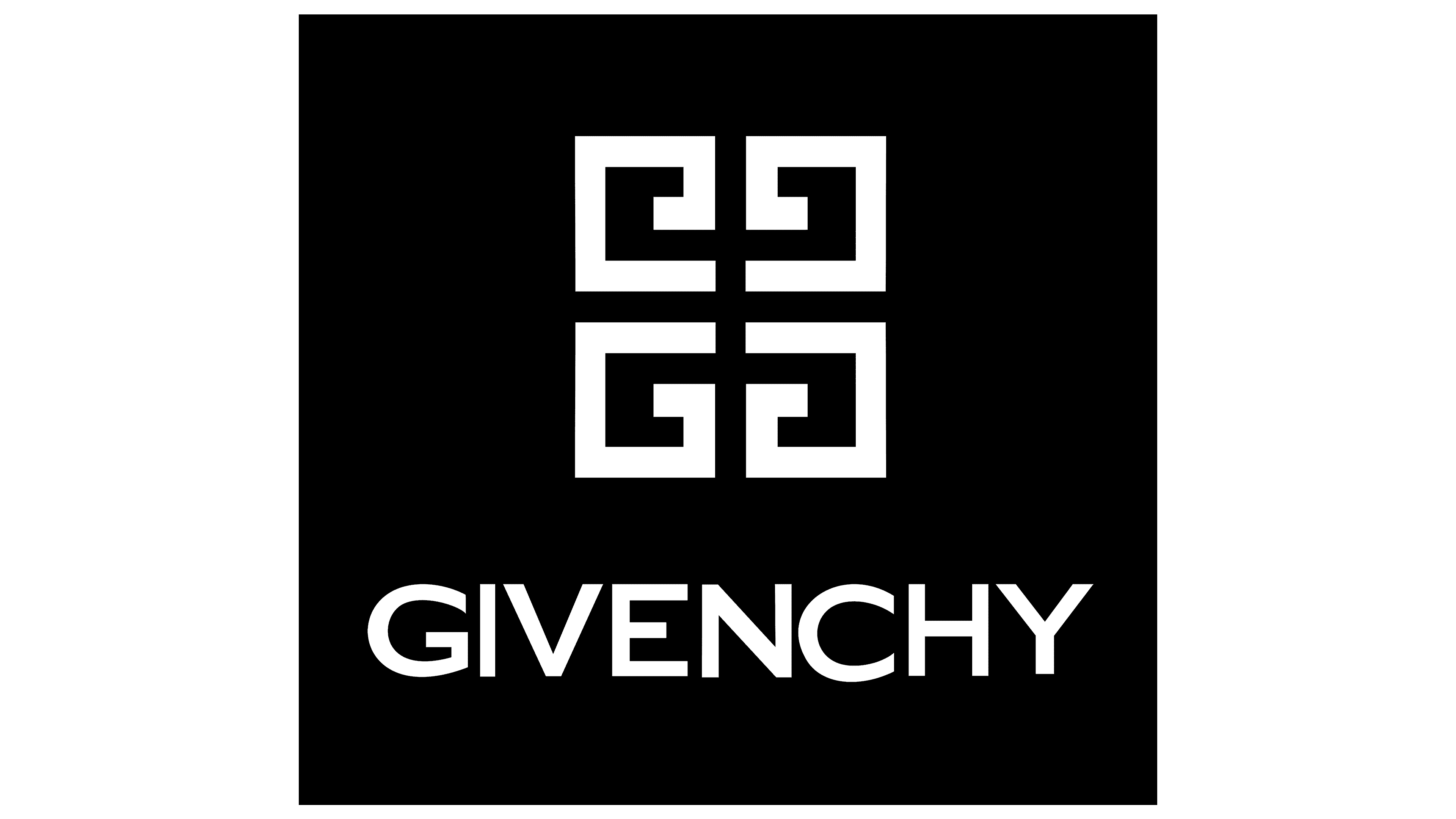
The emblem’s color palette is classic, combining opposing tones: white and black. Their contrast looks good on the logo, forming a 3D effect with a visual play of planes. The background is black, white, or gray, depending on the trademark’s version.