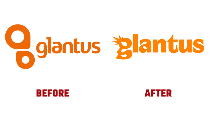
Working with data, the need for constant processing is one of the areas that all enterprises constantly face in their activities. In 2014, to simplify the work in this direction and solve the problems that arise with data, Glantus was created with innovative proposals powerful latest technologies for processing data in the billing and payment market. The company has a presence in several countries, with offices in Dublin, San Jose, London, and Katowice. During its existence, the brand has constantly directed its efforts to expand its capabilities and simplify the interaction with its users. Today it has successfully placed on the AIM market of London Stock, which has significantly increased its market capitalization. This most important step in the company’s development required its appropriate display in the external brand identity, which led to the creation of a new visualization, which was recently introduced to all users of the company’s services.
With a new visual identity, the brand communicated its increased ability to capitalize on the company’s investment in financial automation and analytics. The platform acquired a new attractive appearance, which was based on the principle of minimizing visual load, which ensured the conciseness of the graphic image of the logo and the entire identity. The new identity reflects the main features, goals, and objectives of a global data analytics company, whose activities are mainly3 carried out in the AP sector. The creation of a new personality was based on the two main pillars of the enterprise – the people of Glantus and the new world that was formed. This was taken into account when creating a bold and exciting logo, in which the image of a comet, based on the letter g, became the key figure. This sign has become the main symbol of the Big Bang, which takes place at the moment of the most productive analysis of data from Glantus, which hits the world of AP, filling and developing it. This process frees people from the need to conduct many independent processes, providing greater opportunities and better ways to improve their own lives, relationships with each other, and their clients.
Supporting elements effectively support and amplify the emerging interest in empowering the brand as it grows and expands. This effect is enhanced by an active and vibrant color palette, where bright orange is chosen as the corporate color, a particularly attractive color in which the sign and logo text block is executed on a dark greenish-blue background. This combination helps to increase the visual impact of the brand identity, making it recognizable and easy to remember.


