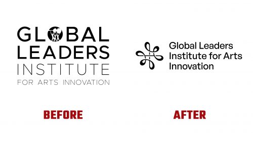
In 2017, the Global Leaders Institute (GLI) was established to equip arts professionals with the skills to lead and innovate. Recently, GLI has unveiled a new brand identity that reflects its commitment to fostering social entrepreneurship, cultural management, sustainable impact, and community development through its specialized MBA program.
The updated logo shifts from the previous design, which included a complex depiction of three figures with a cello, symbolizing global unity but not effectively communicating the institute’s prestige or focus. The new logo design draws inspiration from the fluid movements of an orchestra conductor’s baton, representing leadership’s guiding and unifying role in the arts.
This design uses an infinite-loop motif to suggest continuous movement and learning, capturing the essence of GLI’s educational philosophy. Set against a dark background, the logo’s negative space plays with light and shadow, creating a striking visual impact that draws the viewer’s eye in a continuous flow, emphasizing the ongoing learning cycle and artistic connection.
Accompanying this symbol is a dynamic range of illustrations that adapt to various media. These illustrations highlight the institute’s flexible approach to viewing the details and the bigger picture in arts management. This visual strategy complements the institute’s mission to examine arts leadership on micro and macro scales.
The new identity’s typography is set in General Sans, a modern and clean typeface that aligns with the sleekness of the new logo. The text arrangement balances the institute’s long name by enlarging the icon, creating a harmonious and visually appealing lock-up that enhances readability and brand recognition.
The new identity’s color palette mixes vibrant shades of blue and yellow, complemented by black-and-white photography. This choice aims to enhance GLI’s digital presence, where the striking contrasts and vibrant tones can fully engage viewers. The serif typeface Nanum Myeongjo is used throughout the branding materials, adding an element of elegance and authority that underscores the institute’s prestigious educational offerings.
Overall, the Global Leaders Institute’s new brand identity aims to more accurately reflect its role as a nurturing ground for arts professionals. The identity strengthens GLI’s position as a key educational institution for creatives worldwide by integrating design elements that symbolize leadership and connectivity within the arts.


