In 2002, Woodbury, MN, founded the first 24-hour health and wellness company in the US. The franchise had 4,700 locations on every continent. One of the franchise’s service provision features is that its members can visit any of its fitness gyms throughout the US. Such a service frees all those who monitor their health from constantly being in the required time for training in a particular gym for their workout. As a result, users gain the freedom of activity. All gyms located throughout the US are equipped with the necessary training equipment and implements. If the workouts differ in individual programs, the availability of special equipment and the new Real AF marketing platform will allow you to locate the nearest optimal option quickly.
The app was the update that confirmed the important rule – success is different for everyone. Not only is it achieved with a personalized approach, but it also has an individualized reflection. Based on individuality and the brand’s multi-channel experience, this program does everything to ensure that the trainee gains the fundamentals of his success – confidence, resilience, aspiration, and balance in every element of training on his terms. To achieve this goal, the new program encompasses the breadth of Anytime Fitness’ offerings and the creation of modern interiors at every location in the club, in the context of clearly defined free workout spaces. The new strategy applies the accumulated interactive experience, ensuring that each new member quickly adapts to the training program. The revamped logo plays a special role, with the monogram “AF” as an accent. The logo was based on the timeless effect of the three “northern stars,” which inherently ensured the exclusion of the human factor while incorporating basic truths – the needs of participants, trainers, highlighting the identity of the brand itself and its culture, as well as the accumulated professional capital. The latter is highlighted by the purple shade of the color palette.
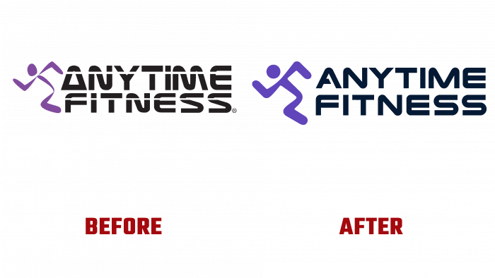
Changes in the logo were implemented minimal. The main objective was to make basic adjustments while maintaining the overall concept of the composition. The logo has been simplified and somewhat modernized, making it less dependent on changes that may occur in the future. At the same time, the updated graphic interpretation became a harmonious addition to the created monogram. As a result, the brand visualization gained clarity and ease of processing digital and polygraphic executions on various materials and surfaces.


