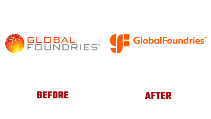
The representative of the world-famous chip manufacturer in the computer market, GlobalFoundries, on July 19, 2021, made a statement about some of the changes in Malta. Based on the in-depth marketing research of the market, which showed the presence of a significant deficit of the product produced by the company, it was decided to carry out a radical rebranding. The need for such measures and restructuring was ripe even before the pandemic, which somewhat slowed down the process, but confirmed the correctness of such a decision.
The company’s activities were based on the production and supply of chips for various types of consumer goods directly to their manufacturers and major global customers. Among them are the manufacturer of electronic devices and computer components Intel, which came up with an offer to buy GlobalFoundries. However, the crisis has demonstrated the need for fundamental changes, including selling products. Dependence on customers has led to a shortage of the company’s products in the global market.
It was decided that it was necessary to pay attention to the innovative direction – System on Chips, which would create smarter microcircuits. The introduction and use of innovations in creating diversified chips are today’s future of mobile and “smart” devices. This approach to production, implementation methods, and further development required GF to reformat its image promotion.
The new company logo confirms that GF has made a breakthrough in rethinking its marketing strategy. This is facilitated by the updated modern font, which contains lowercase letters; the design reflects the company’s history. The shape of the letter “G” resembles a stylized globe, which speaks of the global significance of the company’s products, and also resembles a semiconductor plate. The desire for partnership and cooperation on an equal footing (equality – two figures, the square of the end of the letter “F”) with each of the clients personifies the middle element common to “G” and “F.” The orange color of the logo has been retained in its historic hue, to which have been added yellow and purple – colors that symbolize warmth and bold determination.
By significantly increasing its marketing budget, applying an innovative approach to the rebranding process, the company expects significant results from the renewed GlobalFoundries as a true leader in the semiconductor industry.


