The brewing industry is believed to be one of the most promising sectors of food production. This area will never lose public interest in itself and will always be a “living organism” in the market.
If we talk about design, designers often feel great potential where a well-known brand is developing well; its area is promising and in great demand among consumers. Therefore, to continue forming correct communication with the audience, strengthening its position, and increasing recognition is the company’s key need, which creative agents realize with great pleasure.
It was important for AbInBev to present the rebranding in the spirit of an authoritative and significant brand.
Buyers take a drink in their hands and can be proud that they are involved in the brand; they are part of the community of drink connoisseurs. When buying a product, they express loyalty and devotion to their choice, supporting the company at a status level. As a social unit, the buyer wants to be part of a particular community in which values and attitudes that are significant to him will be maintained.
As for the brewing industry, the drink itself helps bring people together; it is a tool that accompanies parties and all sorts of entertainment, from festivities to cozy sitting at the screens in the company of household members.
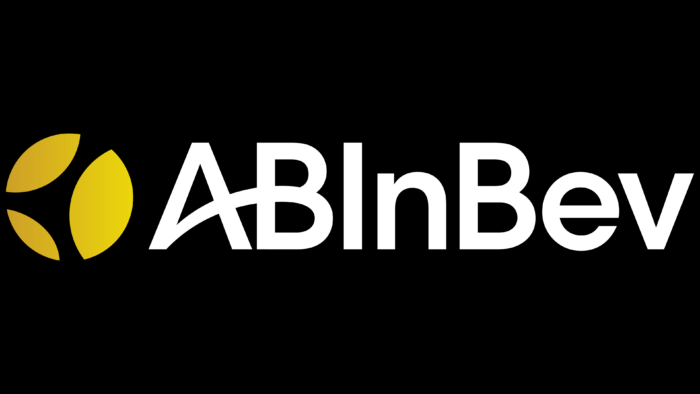
The AbInBev company, under whose auspices leading sub-brands, such as Budweiser, are produced, declares that it wants to keep up with the times, be more relevant and interesting for the community, and therefore updates its design (logo and identity), thereby showing extensive coverage of around the world and hinting at increasing influence in consumer countries.
The modernized trademark looks like an abbreviation, but thanks to the new typography, the brand goes beyond the stereotypical image of beer. The consistent introduction of the new design is a sign that innovations will change the way the public thinks about beer shortly.
The initiators of the rebranding, the company’s management, and partners considered it the most successful marketing move to show global influence through the choice of a golden and black color scheme and the presentation of the globe, on which the continents are depicted as parts of a spikelet. This testifies to the spread of brewing around the world, and the influence of AbInBev only underlines the popular love for the drink.


