


![]() Goldman Sachs Logo PNG
Goldman Sachs Logo PNG
The Goldman Sachs logo represents a safe, safe deposit box. Clients’ money is safe and can be kept in the institution indefinitely. The emblem shows that despite its venerable age, the bank uses modern technologies in its work.
Goldman Sachs began in 1869 when Marcus Goldman, a Bavarian immigrant, opened a small office in Lower Manhattan. He bought short-term notes from merchants and resold them to banks, building a steady business.
In 1882, Samuel Sachs joined, and by 1885, the firm became Goldman Sachs & Co. That year, it established ties with Kleinwort Sons in London, entering international finance.
In 1896, the firm joined the New York Stock Exchange and began underwriting IPOs. In 1906, it led the offering of Sears, Roebuck and Co., introducing valuation based on earnings rather than assets. Later deals included F.W. Woolworth and United Cigar.
In 1929, the Goldman Sachs Trading Corporation collapsed after the market crash, damaging the firm’s reputation for decades.
Recovery was led by Sidney Weinberg, who served from 1930 to 1969. In 1956, he led Ford Motor Company’s IPO, restoring credibility with major clients.
In the 1970s and 1980s, the firm expanded into asset management and acquired J. Aron & Company, strengthening trading operations. It also developed internal analyst training programs that were later adopted by rivals such as Morgan Stanley and JPMorgan.
In 1999, Goldman Sachs went public, raising $3.66 billion and ending its long partnership structure.
During the 2008 crisis, the firm received $10 billion in TARP funds while paying large bonuses. In 2010, it settled SEC charges for $550 million. In 2020, it paid about $2.9 billion in connection with the 1MDB case.
Meaning and History
![]()
When the bank was founded, Marcus Goldman and Samuel Sachs decided to give it their surnames. As a result, the name “Goldman Sachs” appeared. The prerequisites for the financial institution’s development were so successful. The actions were profitable enough that it has become an industry giant, and its logo is known in many countries worldwide. Despite occasional difficulties, he successfully overcame them.
Today, the list of its services includes most professional services, such as investments of all types, banking, and credit cards. He also has several subsidiaries and a high level of trust. Moreover, the institution changed its logo only once (in 2020), prioritizing the sustainability of classics and traditions.
What is Goldman Sachs?
Goldman Sachs is a financial conglomerate nicknamed The Firm in professional circles. Many learned about him when the movie The Big Short, about the financial crisis, was released.
1869 – 2020
![]()
The debut emblem contains only one element, the name of the financial and banking structure. This style is used specifically to show the bank as practical and transparent. By choosing a laconic design, the institution underlined its confidence, as evidenced by its expanded scope.
The top third of the logo reads “Goldman Sachs” clearly and clearly. The phrase appears on two lines. Its background is a blue square of regular shape. But the most important feature of the emblem is the unique combination of letters, upper and lower (“G” and “S”), and two adjacent letters (“c” and “h”). Moreover, “h” and “d” have shortened legs, “a” lacks a bottom stroke, and “m” and “n” are identical in shape because they are equally smooth.
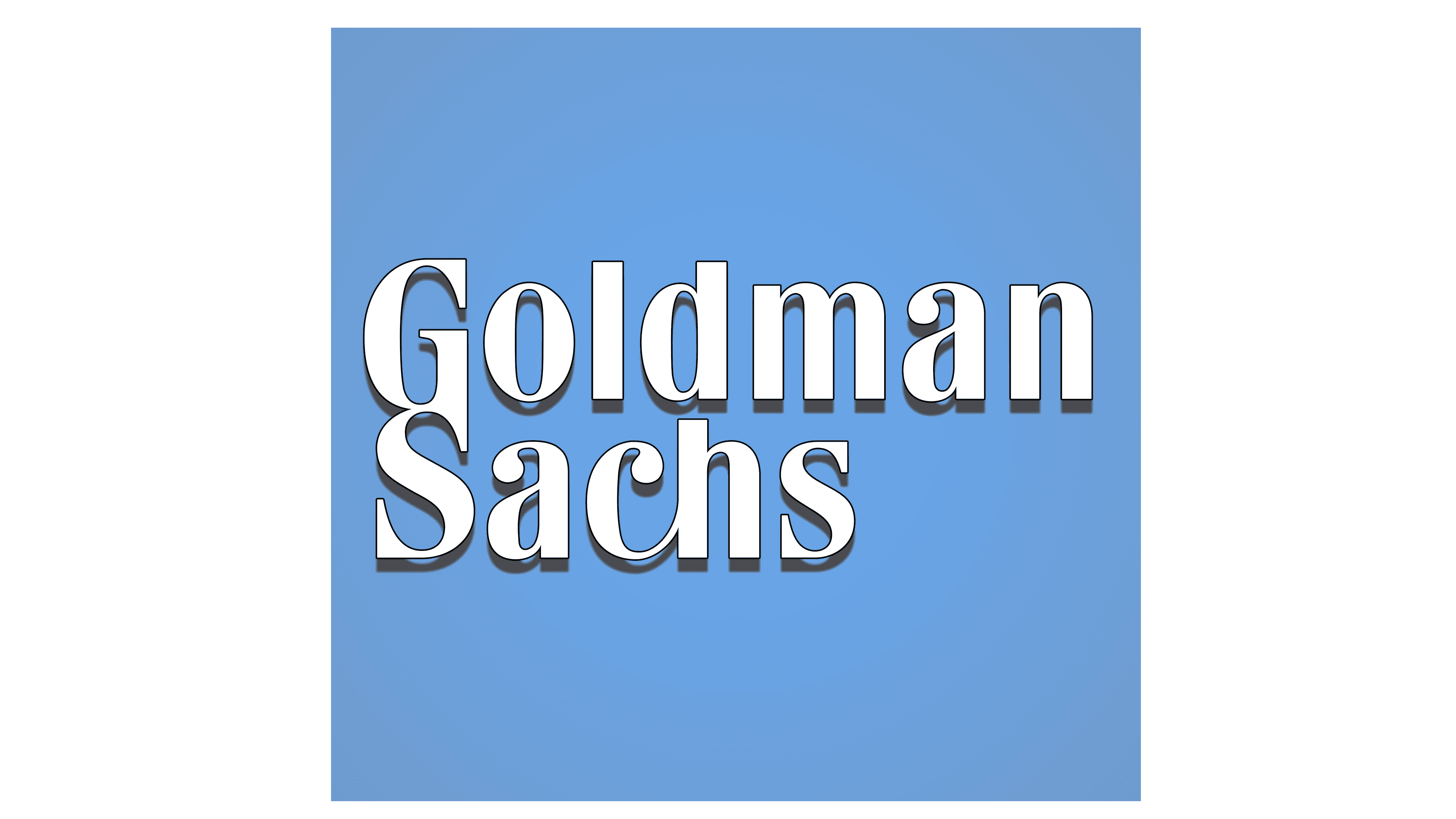
2020 – today
![]()
The modern version visually repeats the previous logo but still differs from it in some details. In this version, there is no connection between “G” and “S,” “c” and “h”: the designers have simplified the letters, making them classic. They also added serifs to them, which now have not only the “S” and “G,” but also other signs, except “O.” Also, the developers changed the square’s color, giving it a slight purple tint.
Font and Colors
From the very beginning, the corporate symbol was minimalistic and remained so throughout its existence. The style of the inscription changed, but its location, shape, and color did not. The actions regarding the square are similar: it has always served as a contrasting background for a financial institution’s name. No other details were added because the bank’s management wanted a clear logo that emphasized service availability and simplicity for potential customers.
The Goldman Sachs custom typeface was created for a large and respected financial company. The first emblem combines serif and sans-serif letters. In the second, it is written with serifs in all cases. Also, Univers, Roboto, and Sabon are available for various media.
The color scheme is simple in terms of the number of shades but complex in its depth. For example, both logos use blue, but in the debut logo, it is heavenly, in the color of the building facades where the bank is located, and in the current one, with a slight touch of lilac.
FAQ
Who designed the Goldman Sachs logo?
The logo was designed by the global brand consultancy firm Lippincott & Margulies. It features a blue square with the company’s name in lowercase, set in serif typefaces (Univers and Sabon).
The blue square conveys trust, reliability, and professionalism, aligning with the brand image as a leading financial institution. The lowercase letters give the logo a modern and approachable feel, while the serif typefaces add a touch of tradition and stability.
What font is the Goldman Sachs logo?
The logo uses a custom typeface called Goldman Sans. This clean, modern font was designed for dense, data-rich environments. The focus was on clarity, readability, and a professional appearance.
The brand combines simplicity with a sleek, contemporary style that conveys complex financial information. The typeface enhances the logo’s overall look, making it distinctive and memorable.
What is the Goldman Sachs symbol?
The market symbol for Goldman Sachs is GS. This ticker is used on the New York Stock Exchange to trade the brand’s shares. The symbol is vital for investors and analysts to discuss and evaluate the company’s stock performance and financial health.
People can track the brand’s stock price, trading volume, and other important financial data using the GS ticker. This symbol helps keep the brand visible and recognized in the financial markets. It shows Goldman Sachs’ significant global role and presence as a leading financial institution.
Who started Goldman Sachs?
Marcus Goldman, a Jewish banker from Bavaria, founded the company. Before starting the firm, he worked as a school teacher. Seeking new opportunities, he emigrated to the United States. In 1869, he founded a commercial paper company in New York City, helping businesses secure short-term loans. Over time, it grew into one of the world’s top investment banks. Marcus Goldman’s legacy and vision shape the brand’s influence and reputation in the global financial industry.
What is Goldman Sachs’s motto?
The company introduced the slogan “You Can Money” in 2019. This slogan presents the brand as accessible and modern in the financial world. The company’s most famous motto is “Our client’s interests always come first.” This phrase reflects the core principle of the firm’s operations. By putting clients’ interests first, the brand has built a reputation for reliability and excellence in the financial industry.
Is Goldman Sachs a brand?
Goldman Sachs is a recognized brand with a clear marketing strategy. Known worldwide for its financial services and investment banking expertise, the brand has built a strong image of trust, professionalism, and excellence.
The brand’s marketing strategy focuses on client commitment, innovation, and leadership in the financial sector. This is reflected in their motto, “Our clients’ interests always come first,” which shows their dedication to client service. The slogan “You Can Money” positions the brand as accessible and modern.
The company has a distinct visual identity, including the use of the Goldman Sans typeface in its logo. This font is designed to be clear, readable, and professional, reinforcing the brand’s reputation as a leading financial institution.