


![]()
Goodreads, the largest platform for book lovers, has updated its logo for the first time since its founding. The previous logo, rendered in brown tones, was neutral, subtle, and calm. It evoked the feel of an old library, familiar but somewhat dull. Over time, it ceased to reflect the real character of the platform, which brings together millions of active readers and reviewers.
The new logo conveys a completely different mood and speaks the language of a new generation of readers. The platform chose an expressive, modern, and less formal typeface with gentle curves and playful accents. Instead of the former seriousness, Goodreads now presents a lighter, more playful symbol.
![]()
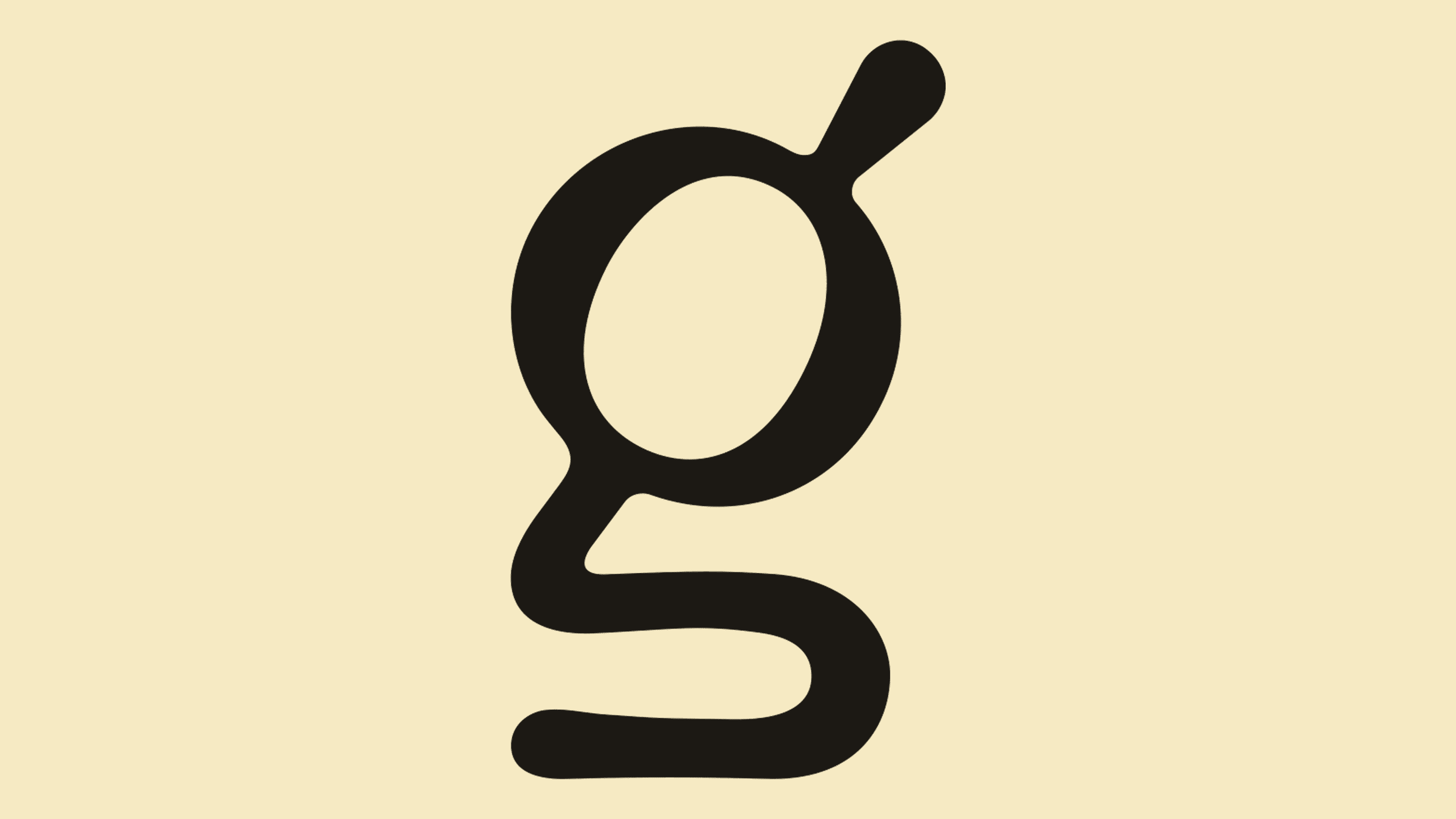
A key detail is the letter “g,” which the designers imbued with dual meaning. The lower part resembles an open book, while the upper part resembles a magnifying glass. Thus, with a single graphic stroke, the logo communicates its essence. On this platform, one can search for books, explore reviews, and engage in discussions about the book itself, which is an object of continuous discovery.
This style aligns perfectly with current trends in book culture set by social media platforms like TikTok and Instagram, where books have become visual stars. Publishers actively use bright and dynamic covers designed to catch attention amidst endless social media feeds. Goodreads has embraced this movement, and the new logo demonstrates its desire to stay in tune with readers who expect books to provide not only content but emotional engagement and inspiration.
The updated identity employs an energetic black color, creating contrast and readability across all devices, from smartphones to outdoor advertising. The brand has become more visible, approachable, and appealing to younger generations eager to share their reading experiences, post book covers online, and discuss books in real life. Goodreads’ redesign highlights a significant shift: the book is no longer merely a source of knowledge, but a symbol of communication, inspiration, and genuine curiosity.
The new visual identity feels brighter and more emotional, signaling to readers that books here are discussed with vibrant curiosity and interest rather than academic detachment.
![]()