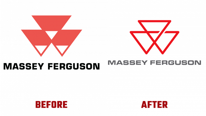
AGCO Corporation’s global brand Massey Ferguson announced a facelift and introduced a new logo in the form of transformed three triangles.
To support the new visual design, a slogan was developed that most fully reflects the philosophy and values of the brand – Born to Farm. In the coming 2022, the 175th anniversary of the company’s creation will be celebrated; we can say that the rebranding is timed to coincide with the festive date.
Seriously speaking, the company has reached a certain milestone. It is necessary to keep up with the times, not only in the technological sense but also to be able to set up communication in the new economic conditions. The influence, the credibility of the company, the leading position in the field of agriculture, the reliable technology, and the easy operation of the machines that the brand provides all form the core of the brand.
A profitable and sustainable business, which is a priority for Massey Ferguson, has become a cornerstone in building long-term partnerships with farmers worldwide. Demand is growing, the brand is transforming, and now the company is at its peak of popularity as never before. Therefore, it is important to maintain leadership in the industry and set a certain unattainable bar for competitors.
Since 2019, the brand has been slowly approaching the rebranding issue. The management of the company faced the desire to become more innovative and creative; decisions were weighed, pondered the idea of the slogan, and now, finally, they were able to come up with the idea that fits perfectly into the framework of the new era of the brand’s existence.
Since 1958, the company’s business card has been three triangles, symbolizing unity, trust, mutually beneficial cooperation between agricultural producers, dealers, and the brand.
Three triangles are arranged so that it turns out that white triangles appear in the gap, except for the red ones. At the bottom, there is a black inscription with the company’s name, even though there is a feeling that the font does not quite fit the logo. It is smaller in size and has specific lettering. It can be said that it was made as if chopped, strict, but also less noticeable than the logo. Due to the small letters, you have to look closely at what the name of the company is.
This is not to say that the designers made a gross mistake. Most likely, this is a defect, which eventually stopped paying attention since the main logo became a vivid association with the brand so that the name could remain inconspicuous.
Now the rich red color of the contour logo looks innovative and even revolutionary. The intersecting lines create three triangles, inside which a shallow fourth appears. It is located in the very “heart” of the logo; for sure, it embodies the heredity and continuity of the previous one. Another notable detail is breaking the lines towards the upper and right triangle. This is just a visual highlight, not calling for anything. The descriptor has become not black but dark gray, and the font itself is made in a pleasant graphic manner when the letters’ even and slightly rounded shapes increase in width and make them more expressive.
In general, the new logo can be assessed as very memorable and visually unloaded. The image of the old logo is preserved, but now the self-sufficient, actual and fresh image focuses on the modern approach of the company, its ability to adapt to the new realities of life. We can confidently say that Massey Ferguson, which deservedly occupies a top place in the rating of agricultural machinery manufacturers, is very good with the new look.


