


![]() Google Workspace Logo PNG
Google Workspace Logo PNG
Designers ensured that the Google Workspace (formerly G Suite) logo stylistically matched the icons of all applications from the parent company. The emblem’s modern design is associated with innovation and collaboration, the very foundation of teamwork. In essence, the word mark reflects the core of the tools and services included in the package.
Google Workspace grew from separate Google services released before the suite had a single name. Gmail launched in April 2004 with 1 GB of storage per user, far beyond Hotmail and Yahoo Mail at the time, and introduced threaded conversations. In February 2006, Google tested corporate Gmail at San Jose City College, using the school’s own domain.
On August 28, 2006, Google launched Google Apps for Your Domain, including Gmail, Google Talk, Google Calendar, and Google Page Creator. It gave organizations an admin console for accounts and security, while mailbox storage rose to 2 GB. In October 2006, Google Apps for Education launched, and Google later acquired JotSpot, which was later used for Google Sites.
The paid Google Apps Premier Edition followed in February 2007 at $50 per user per year, with 10 GB of added storage, APIs, phone support, and a 99.9% Gmail uptime guarantee. Early customers included Procter & Gamble and Salesforce. Google Docs came from Writely, bought from Upstartle in 2006; Spreadsheets grew from 2Web Technologies; Tonic Systems and Zenter helped create Google Presentations in 2007.
In 2009, Gmail, Calendar, Docs and Talk left beta. The suite became Google Apps for Business in 2010, gained Google Drive in 2012, then became Google Apps for Work in 2014 and G Suite in 2016. In October 2020, it was renamed Google Workspace. By October 2021, it had more than 9 million paying companies and over 170 million education users. Duet AI arrived in 2023 and became Gemini for Google Workspace in 2024.
Meaning and History
![]()
Before becoming Google Workspace, the application suite underwent several rebrandings. It was renamed multiple times and frequently received new logos that reflected its name. However, all the word marks consistently matched the design Google adopted at different times. This requirement primarily pertained to the use of proprietary fonts and color palettes. They were chosen to visually connect all the company’s products.
What is Google Workspace (G Suite)?
Google Workspace (G Suite) is a set of cloud services first introduced in 2006. These applications are designed for collaborative work in an online office, facilitating close connections among employees. Essentially, it’s a fully functional digital space where team members can interact in real-time. Here, tasks can be planned according to the calendar, documents edited, meetings conducted, and data stored.
2006 – 2010
![]()
In 2006, two application suites were released: one for organizations (Google Apps for Your Domain) and another for educational institutions (Google Apps for Education). The logo from that time was based on the company’s old wordmark, created by Ruth Kedar in 1999. It uses the Catull font, an elegant antique with thin serifs. Traditionally, each letter is colored differently: the capital ‘G’ and lowercase ‘g’ in blue, “o” and ‘e’ in red, another “o” in yellow, and ‘l’ in green. Due to the gradient and dark shadows, they appear convex, like three-dimensional figures. Under the two ‘o’ is a small gray inscription ‘Apps,’ executed in a standard semi-bold sans-serif font.
2010 – 2013
![]()
On May 6, 2010, Google changed the design of its name, so the cloud applications package logo was updated as well. Now, the letters in the first word are lighter: their broad shadows disappeared, and the gradient acquired many bright and warm shades. The font remained the same, Catull. The word ‘Apps’ was enlarged and placed on the right side. It remained gray, but the glyph shape differed from the previous version, with developers using a thin grotesque with wide inter-letter spaces.
2013 – 2015
![]()
This logo belongs to the Google Apps for Business application suite, launched in 2007 and known as Google Apps Premier Edition until 2010. It features the new Google emblem introduced in 2013. Here, the parent company’s name is written in two-dimensional letters without shadows or gradients. On the right is the gray phrase ‘Apps for Business,’ styled in a very thin sans-serif font.
2015 – 2016
![]()
In 2014, Google Apps for Business was renamed Google Apps for Work, and a year later, the owning corporation introduced a new family of logos for all its products. The word “Google” is now in the Product Sans font, but it retains the distinctive slanted ‘e,’ inspired by Catull. The colors remained unchanged. The rest of the text is set in a similar semi-bold sans-serif font.
2016 – 2020
![]()
On September 29, 2016, the application suite was renamed G Suite and received an emblem with the corresponding inscription. All letters are colored in uniform gray, so there’s no association with the classic Google word mark. The design uses the company’s proprietary font: a geometric grotesque with diagonal cuts at the ends of the strokes.
2020 – today
![]()
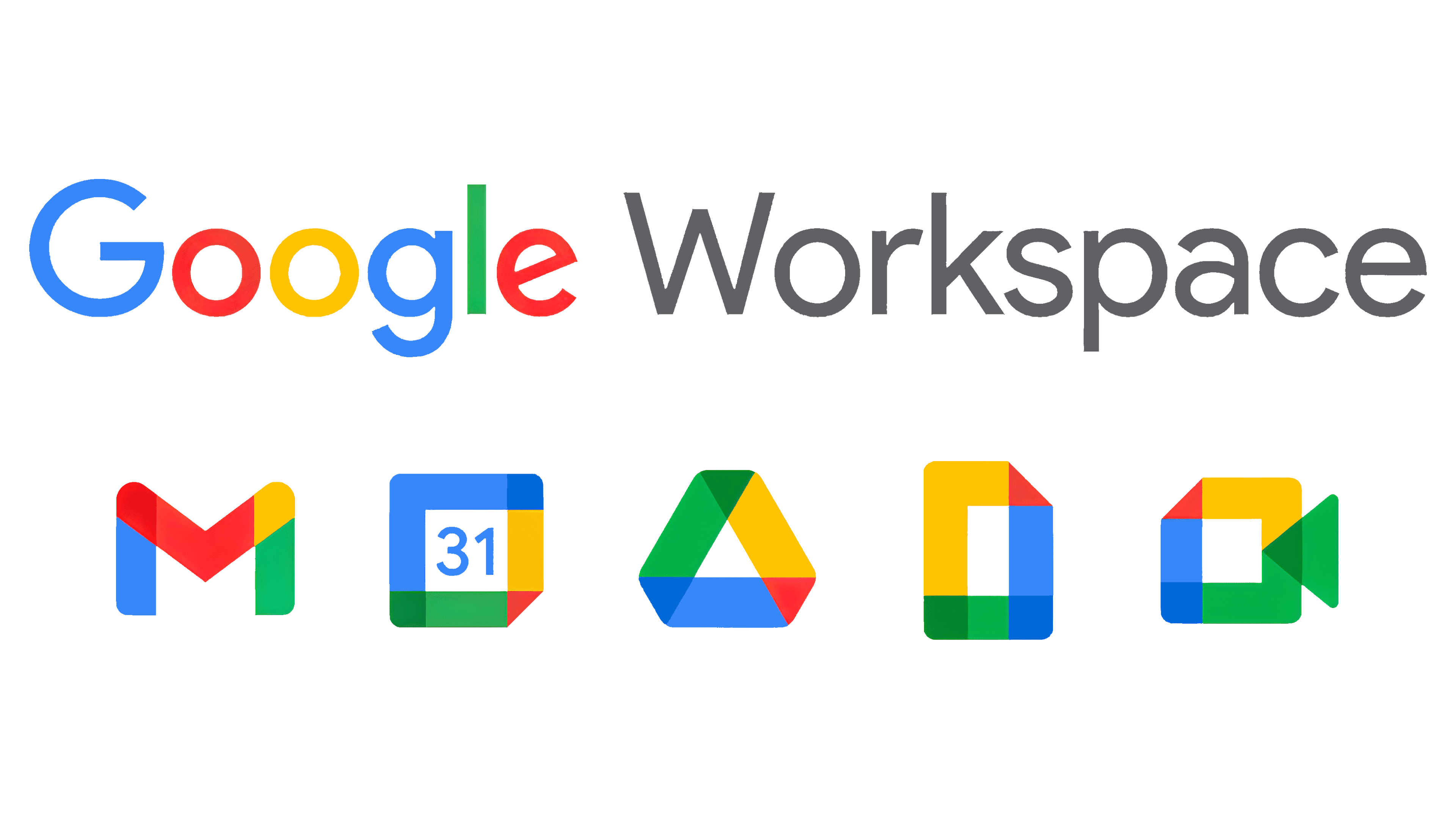
The company owning the application package decided to standardize its identity, creating identical icons for all tools. Simultaneously, it relaunched G Suite as Google Workspace. The branding agency Wolff Olins developed a new logo for the package, bringing back the famous word mark with multicolored letters. Following it is the gray inscription “Workspace,” matching in style and size. This emblem was introduced on October 6, 2020.
Font and Colors
Old logos used the Catull font with short, sharp serifs. After 2015, it was replaced with Product Sans, a proprietary grotesque created by Google’s designers specifically for its products. School textbooks inspire it and use a universal letter form that adapts to screens of any size.
The colors correspond to Google’s traditional palette. This includes a wide variety of vibrant shades such as blue, green, yellow, and red. A restrained gray color balances them.