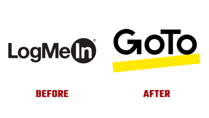
The well-known service for the provision of communication services, LogMeIn has significantly expanded its capabilities by radically changing the conditions and list of its services. To provide full information about the changes and improvements that have taken place, the brand has undergone a deep rebranding, starting with a change in its name, corporate identity, logo, and entire visual identity. Becoming a GoTo service has created a new affiliate network. In the complex, users purchased a functional and efficient set of products, an updated application with unifying solutions in the field of providing quality support and communication. Recognized as a technology leader in strangled work, the company has demonstrated its commitment to modern trends, including the cause of simplification of IT, regardless of location, with its update. One important change was the launch of a portfolio of new products with an app and two flagship offerings – GoTo Resolve for management and support and GoTo Connect. A new affiliate program has been activated to develop further the ecosystem that has been created, covering the whole world.
With the help of the application, more than 800 thousand users are listening, and more than a billion are constantly joining meetings, webinars, online classes. It’s in the growth of user demand for such services. The new visualization created a special atmosphere and a unique brand perception. The text module in the form of a single composition of the company name, created without spaces, attracts the eye with an asymmetrical arrangement of the letters “O” around the capital letter “T” and the originally executed “G,” whose lower “tail” is an arrow pointing to the right and up, symbolizing the constancy of movement forward, the desire to develop. The text is made in strict black color, making it noticeable on any background. An original visual solution was used to focus attention on the text block – a wide stripe in bright yellow color was created below the text. Its execution at a certain angle creates the effect of accelerated movement, where the letters “O” take the form of wheels carrying the logo forward to success.
The overall visual construction of the logo provided not only its special appeal. It stands out against any background and is easy to read in print and digital versions. The text is easy to read at any size of drawing or demonstration. Its peculiar composition has some emotional impact, making the logo memorable and immediately recognizable.


