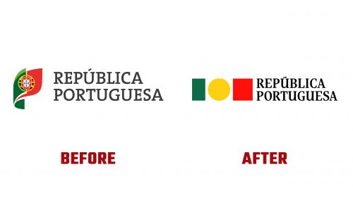
The Government of Portugal has recently unveiled a new logo, signaling a significant shift in its visual identity. This change comes as part of an effort to modernize and simplify the representation of the Portuguese government’s brand, making it more accessible and recognizable across various media platforms. The new design departs from the previous, more detailed emblem, opting for a minimalist approach that abstracts national symbols into geometric shapes.
The Government of Portugal, functioning as a key sovereignty body alongside the President of the Republic, the Assembly of the Republic, and the courts, plays a critical role in the country’s governance and public administration. With the introduction of the XXIII Constitutional Government in March 2022, the timing of the rebrand aligns with the commencement of a new term and leadership under the current prime minister.
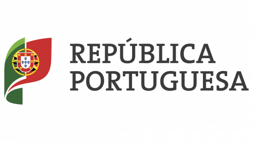
The previous logo incorporated the coat of arms centered within the icon, featuring a level of detail that, while technically correct, posed challenges for reproduction on smaller scales and diverse applications. The redesigned Government of Portugal logo adopts a radically simplified flag interpretation, distilling it into three basic geometric forms. This stark simplification has sparked debate among the public and design community, with some expressing concern that the new logo might oversimplify or diminish the importance of Portugal’s national symbols.
Despite mixed initial reactions, the new logo aims to offer a clean, efficient visual identifier not just for Portugal as a nation but specifically for this iteration of the government. It seeks to establish an iconic and minimalist identity akin to those of Germany or Amsterdam, capable of being expanded and applied cohesively across various contexts.
Critics of the new design have pointed out that the large yellow circle, intended to represent the armillary sphere on the Portuguese flag, might be misconstrued as a sun due to its size and abstraction. Nevertheless, the overall simplicity and the combination with the new proprietary serif typeface add a dignified and authoritative tone to the government’s presentation.
While much of the identity’s application remains conceptual, the foundation for a robust and elegant system is evident. Dino dos Santos introduced custom typefaces featuring a unique blend of condensed serif and sans serif styles, which enhances the logo’s sophistication and distinctiveness.


