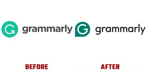
Grammarly, a well-known tool that helps people write better, has just shown off a new look and a brand-new logo. This update is a big deal because many people know and use Grammarly’s old logo to make their writing clearer and mistake-free.
The new logo is shaped like a chat bubble with a “G” in it. This is a change from the old “G,” which was also a clever part of how Grammarly’s app worked. The new design moves towards a simpler way of showing digital talking, slightly different from the unique logo and app design mix they had before.
The heart of the new logo is a green circle with a white checkmark inside. This is meant to show what Grammarly is about: making your writing spot-on, clear, and correct. This fits with Grammarly’s goal to help everyone “get it right,” making sure people can write confidently without mistakes.
Changing to a newer design shows Grammarly’s plan to keep up with fast-changing tech and reach even more people. Even though lots of users liked the old logo because it was smart and worked well in the app, the new logo is supposed to make Grammarly stand out more as a key part of today’s digital talking world.
This update to Grammarly’s look is more than just a new style; it’s a sign of Grammarly’s promise to keep making writing better for everyone, no matter where they’re writing online. With a logo that’s all about quick and interactive talking, Grammarly is ready to keep leading the way in helping with digital writing.


