In 1995, the country music channel Jones Radio Network had no idea that it would ever be renamed the pretentious GAC Family and become a major television channel.
Customer Experience Agency DEFINITION 6 (D6) has announced the rebranding of the American cable channel Great American Country and introduced two new personalities, GAC Family and GAC Living.
At the end of September, the two channels debuted under the slogans “Well-Told Stories” and “Well-Lived.”
DEFINITION 6 worked closely with Bill Abbott, President, and CEO of GAC Media (parent brand), to create a visual identity and creative brand strategy for both networks.
According to the creative initiative group members, it was an ambitious project that set itself the task of visually and tonally identifying two independent entertainment brands and bringing them to the market as two separate objects with their presentation and values. The two major channels reach 40 million viewers.
The rebranding results in realized logos, mnemonics, broadcast graphics packages, and advertisements and websites.
The corporate identity of each chain conveys a sense of family cohesion, joy, and comfort unity.
Brand stamps, the words FAMILY and LIVING are oriented with the same font. They are italicized simple outline lettering on the right. And stamps with the designation “gac” are outlined in a circle on a white background. The color determines the difference between the logos – GAC Family has a dark burgundy hue, while GAC Living has a dark green.
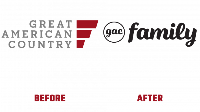
Compared to the earlier logo, it is very noticeable how far the current design has gone. Previously, the Great American Country logo looked like a typographic typeface with three lines and three red lines, varying in size.
A definitely more consistent and harmonious style of logos is presented now. This will contribute to better brand awareness and consumer loyalty.


