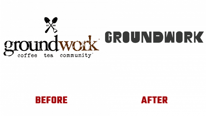
In 1990, for the first time in the history of southern California, a certified coffee roasting company, the Groundwork Coffee Company, appeared. Gradually, the company’s development allowed it to open eight cafes in Los Angeles and become the largest distributor of coffee and tea in California. The use of the Internet and modern technology has expanded the sales of Groundwork Coffee products, covering the whole world. The desire to grow and ensure brand awareness outside the US has been the impetus for updating the visualization of the Groundwork Coffee Company. The creative branding agency Ludlow Kingsley (Los Angeles, CA), with over a decade of experience, took on this task. A distinctive feature is a non-standard approach and love to create aesthetic, beautiful, and original solutions.
The company logo was completely redesigned by hand by the designers of the brand agency, which allowed creating a completely new visual perception. Accuracy of information transfer of the company’s activities was achieved. The thick black typefaces provide a representation of quality coffee roasted beans. Each letter has been worked out to create a single style solution and a harmonious perception of the text of the company name. The font’s geometry and monochrome color performance ensured its clarity of perception on printed surfaces and digital media. The use of such a logo began to look especially effective on packaging with coffee, distinguishing it very favorably from similar products on retail shelves. The text provides simplicity and ease of product recognition in a digital environment, which is especially important for increasing consumer appeal.
The use of a new color palette on packages of various types of coffee has increased the recognition and ease of choosing the desired type of coffee. Soft, non-toxic light shades of the color palette provided the required contrast of the logo. The selection of colors was based on the shades of natural landscapes characteristic of Southern California’s – golden chapparles, coastal olive oaks, soft blue skies, and coastlines.
The addition of a new visual element – the soil on which the stylized flower grows, and the human hand provided an understanding of the direct relationship between man and nature, the basis for making quality coffee.
All visualization aimed to create the required perception of that passion and hard work, thanks to which the coffee is of high quality and acquires a unique taste.


