The designers at Graphéine did a good job of hiding a lot of symbols inside an unusual logo.
Groupe Cheval is a French organization that specializes in public works. The company is engaged in everything related to roads, including the production of special coatings. Now Groupe Cheval has acquired a separate meaning and mission, which brings together 630 men and women to contribute to the development and future of the country. One of the main values of the company is the environmental contribution in the process of its activities.
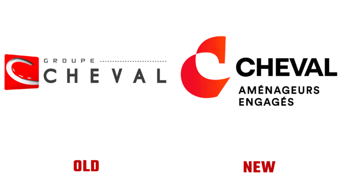
The previous Groupe Cheval logo only displayed one side of the road. It completely lacked the idea of environmental friendliness, biodiversity conservation. Thanks to Graphéine, the company’s visual identity has sparkled with new colors and transformed into something more than just a picture.
Perhaps it will come as a surprise, but the laconic logo combines as many as five symbols, which reflect the company’s activities. The name Cheval translates from French as “horse,” which is why a horseshoe was used in the previous image. The designers left the “C” idea as the basis of the logo but removed the horseshoe symbol. Instead, they added the image of a horse, which intertwines harmoniously with the “C” and creates a light logo.
In addition, three more elements are hidden in the logo: a recycling sign, a green leaf, and an image of a road. Together they create an airy and minimalist design. Also, the designers have worked on the font. The previous name was made in a font with very large spacing between letters. This spoiled the impression of the logo a little, and the overall design was not very successful. The symbolism that can be traced in creating the logo makes it even more interesting to the audience.


