Gumroad is an e-commerce company and a platform with many powerful digital tools and services. The company’s potential is enormous, and it was founded in 2011. In that time, the brand has had books, courses, opportunities to become a member of the digital community, and direct digital commerce services.
The new brand emphasizes the “stickiness” of its services and states this in its new identity.
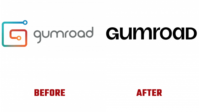
Decided to focus on the company’s name in the new logo, because previously there was the image of the letter G as a connection mechanism. But in the current realities of the digital market, it looks boring, ordinary, and not interesting.
It’s worth saying, though, that the earlier font was much better than in the new logo. It was slightly beveled, had a soft gray hue. And the badge itself included blue, green, orange shades, shimmering gradients but was quite catchy.
Speaking of the updated logo, we can say that it looks homogeneous, presentable, prestigious. But without any zest at all. Though the chosen font suggests the absence of an additional visual element, something is missing, which would catch the eye. Well, maybe an arrow in the letter G, and that’s just by accident.
In general, it looks quite flat and ordinary. Perhaps later management will reconsider its attitude to this logo, so it is impossible to say unequivocally that the update means failure. Most likely, at the stage of expansion, the company will consider all the nuances and make the logo more innovative and modern.


